Communication With Images-Evaluation
- Jun 8, 2017
- 24 min read
For my second year in my Graphic Design course, I was assigned a unit called Communication With Images. This is how we can communicate with imagery in Graphic Design such as posters, flyers and illustrations etc. Projects assigned to me were that I had to create a sequence of images such as illustrations linked to one specific subject, I chose to do the Four Seasons, but they had to be linked to the subject in question. The second was a stamp project, linked to an art movement of the last 200 years, I chose to do Pop Art as an art movement and the third was a Olympic logo and mascot for a specific country and city. I chose to do Glasgow in Great Britain for my Olympic choice. And I had to do research inbetween projects for this unit. Here is how it all went:
SEQUENCE
One of the units in the CWI assignment was to work on a series of illustrations such as the 4 seasons above which I created for this unit. Elements were added to this illustrations to signify the 4 seasons, such as Spring, Summer, Autumn and Winter in the same High Street.
RESEARCH
Here are some art pieces that I looked up for ideas into my sequence in terms of colors, hierarchy and so on:


WHAT I LIKE ABOUT THE WORK
•Good colour uses and pretty much matches the seasons
•They tell a good story and indeed are a big source of inspiration for my project
•The elements that will aid and guide my poster design based on the four seasons
•The good attention to detail that has been originally been created by these artists
Image sources:
SPRING ARTS
http://museu.ms/article/details/108530/daily-art-story-spring-in-art-our-favorite-spring-landscapes
SUMMER ARTS
1.http://www.saleoilpaintings.com/paintings/various-artists/summer-time-field.html
2.http://www.saleoilpaintings.com/paintings/william-trost-richards/william-trost-richards-along-the-beach-towards-sunset.html
[endif]
AUTUMN ARTS
https://unwinedpainting.com/art/autumn-art-favorites/
WINTER ARTS
https://wallpaperscraft.com/download/landscape_painting_art_winter_snow_river_48071/3840x2400#
THE FINISHED PIECES


These were created using Adobe Illustrator and in RGB color mode. I think they came out looking really well and realistic and to look at these they look as if they are suited for children giving the outlook and how it is laid out. I will talk about each individual painting separately.
SPRING
This illustration is based in Spring on a high street. It is a sunny day as there is an old man sitting down on a bench with just a T-shirt and a pair of trousers on. He isn’t wearing a coat and is wearing flip flops. He is watching the world go by around him.

Also there are two people sitting down outside a coffee shop drinking coffee looking very summary and enjoying life in the high street.

It evens shows patriotism as it contains the flags of the UK and England, stipulating that this is in a British High Street where this illustration is set at.

It even shows a communist element as it also contains the flag of the People’s Republic of China in it as this design has a Chinese Restaurant in the design.

The Chinese Restaurant if on the far left. Other important factors in this image is showing that children can be independent from adults in numbers that is, not alone.

1. SPRING HIGH STREET
•This is the first of a group of 4 images that are linked to one subject.
[endif]
•This illustration tells the story of Spring in a British High Street.
[endif]
•I’ve added a multi-cultural element into this artwork in the form of the flag of China which flies over the Chinese Restaurant.
[endif]
•This artwork also contains traditional patriotism as stated with the British and English flags that hang over the town hall.
[endif]
•There is quite a lot of line usage in this artwork, the features on the buildings like the town hall for instance.
[endif]
•Most of the colours in these illustrations are cheerful and vibrant and the only powerful colour being the black colour on the road representing the tarmac.
•Most of the colour textures are flat, with some gradient use such as the sky.
[endif]
•Most of the buildings are attached to each other and it looks spacious enough.
[endif]
•The scene in the design looks harmonious as people are always smiling whilst going around their daily business and clearly enjoying life and what not.
[endif]
•The high street looks a bit quiet though as there doesn’t look to have many people in it as this is unusual for a British High Street, even on a normal day.
[endif]
•Most people appear to be driving their cars on the street and there are people walking along the shops, going shopping or going to work.
The other 3 illustrations accompanying this are set in the same location, but elements have been added to accompany the atmosphere behind the seasons. So far, all the points stated work really well, although a few tweaks remain, I will discuss these later on in the evaluation.
SUMMER[endif]
The summer illustration is in the same location as before. There is now an Ice Cream van with an Ice Cream man happily serving a Mum and her 2 boys. The old man on the bench in the Spring picture is not there now and the bench is empty.

The people sitting down outside the café are the same 2 people sitting outside the café wearing the same clothes that they wore in the Spring picture.

In addition to this, there are children that have gone from visiting the toy shop to skateboarding and gum chewing whilst the Ice Cream van remains in the background.

We even have children kite flying in the park happily as this is what most children do at that time of year.

2. SUMMER HIGH STREET
•This is the second of a group of 4 images that are linked to one subject.
[endif]
•This illustration tells the story this time of Spring in the same location as the Spring picture..
[endif]
•The Patriotic and Communist feel still remain as the flags of England, Britain and China still remain.
[endif]
•There is quite a lot of line usage in this artwork, the features on the buildings like the town hall for instance.
[endif]
•Most of the colours in these illustrations are cheerful and vibrant and the only powerful colour being the black colour on the road representing the tarmac.
[endif]
•The colour scheme in this artwork is brighter than the Spring and all the pink colours representing the blossom has all gone now as this illustration is now set in summer.
•Most of the colour textures are flat, with some gradient use such as the sky.
[endif]
•Most of the buildings are attached to each other and it looks spacious enough.
[endif]
•The scene in the design looks harmonious as people are always smiling whilst going around their daily business and clearly enjoying life and what not.
[endif]
•This illustration also contains family unity and youthful independence as depicted with the Mum and her 2 boys and the kids on the skateboards.
[endif]
•There is a bit more life in this illustration, with the added Ice Cream Van and the family and the skateboarding kids.
[endif]
•Most people appear to be driving their cars on the street and there are people walking along the shops, going shopping or going to work.
AUTUMN[endif]
The two people sitting outside the coffee shop have now disappeared now due to the change in the season whilst people walking the street have now dressed up according to the weather.

Halloween has been added to this illustration, with the mother and child dressed as witches, obviously going trick or treating whilst all the leaves have fallen from the trees and all on the ground.

3. AUTUMN HIGH STREET
•This is the third of a group of 4 images that are linked to one subject.
[endif]
•This illustration now tells the story of Autumn in the same location as the Spring picture..
[endif]
•The Patriotic and Communist feel still remain as the flags of England, Britain and China still remain.
[endif]
•There is quite a lot of line usage in this artwork, the features on the buildings like the town hall for instance.
[endif]
•Most of the colours in these illustrations are cheerful and vibrant and the only powerful colour being the black colour on the road representing the tarmac.
[endif]
•The colour scheme remains the same but hints of browns and reds have been incorporated in to match the season in question, Autumn.
•Most of the colour textures are flat, with some gradient use such as the sky.
[endif]
•Most of the buildings are attached to each other and it looks spacious enough.
[endif]
•The scene here now looks a bit bleak and a bit misleading as it is always unusual for a British High Street to be like this, even on a Sunday.
[endif]
•There is only a very few people out and about now, most of the people are driving their cars on the road.
[endif]
•The Ice Cream van has now disappeared signifying that summer is now at an end and it is replaced by witch dressed characters such as a Mother and child as well as pumpkins for sale in the greengrocers.
[endif]
WINTER
There is absolutely nobody on the street now. This scene could be set on Christmas Day as everything is closed on Christmas Day, but yoga classes look to be remaining, so could still be a normal day but the weather being so bad that nobody can go out.
The snowman on the right is dominant in this picture as he appears to really stand out but the picture still retains it’s patriotic feel with the flags still remaining. The trees have disappeared on the high street though, this could be set elsewhere with the same shops as these shops could have been a chain perhaps such as Marks and Spencer and Sainsbury’s.
Note: I did not add screen shots detailing this piece as this is in the same location in spite of me stating otherwise above, but it is completely bleak now backing the words in the traditional Christmas carol, In the Bleak Midwinter. This looks to be definitely the case here.
HIERARCHY

One piece of hierarchy that I wish to discuss here is that I gave this image a perspective outlook right here in this illustration. I am only providing one example as the same applies to the other designs in this series.
This also shows a 3Dimensional feeling as to how slanted the 2 buildings look here from the sides and the angles that they are set at.
[endif]
INSPIRATION

This is a lithograph painting created by a man called Escher in the 1950’s. This was an inspiration of adding a perspective 3dimensional element into the high street designs. It looks really strange as to how it is laid out and really eye catching.
IDEA BEHIND THE HIGH STREET

I used the same outlook in my high street that is in this one, except I made it look more spacious and added a park in the background.
I added trees along the street in mine and inspired me to give my design the same perspective outlook stated in this design here.
The High Street looks as if there is more going on here than there is in mine as there are people all over here, but only a few in mine. This one looks busier I think than mine does.
On the market side of the street, mine doesn’t have a market, just a sidewalk with two benches and trees and doesn’t have a church in the background in it.
This design doesn’t have a seasonal background like mine does.
[endif]
OTHER THEORIES USED

I pretty much used a good colour theory for the work completed here as these contain just about most primary and secondary colour use.
Semiotic theory was also used in the shape of the people in my High Street illustration as the shapes represent the UK road sign for the children running to school sign, that to me is what I can make of this.

I might need to look more into Semiotics in general in the future for future projects perhaps.
THE SIGN I AM TALKING ABOUT

I represented my people by using something like this as an example.
The people in the illustration match the same description as the school sign Except they are colored and have hair.
BITS THAT COULD BE IMPROVED-SEQUENCE


The only real improvements that need fixing up a little bit is the white lines on these top photographs above which I discovered when the work was printed.
I could maybe add more people to the illustrations to make them look a bit more lively perhaps, but overall I think they look fine as they are, especially the perspective element in the design.
STAMP PROJECT
Firstly, I will begin by adding the relevant research of stamp designs and annotations over the years.
RESEARCH

This is a stamp with the design of Buckingham Palace in 2014, it looks as if this is a photograph taken by somebody for this stamp or a watercolour painting. This is a British stamp as it has the Queen’s head on it and hence the design on the stamp itself. The design is vibrant in terms of colours and obviously, it was done in the summer time as it looks bright but a little overexposed if this was created using Image Manipulation Software. Otherwise it would work well given the space and it otherwise scales well.

These are stamps featuring characters of a series of British children’s Television programmes of the past such as Andy Pandy and The Magic Roundabout. These designs are effective in terms of colours as these are images/screenshots and most of them look vibrantly done colour wise. They work really well given the terms of the spacing and scaling and they originate in Great Britain given the Queen’s head on each of them and the fact as stated that they are British Kids TV programmes of the past.

These are also stamps featuring characters of a series of other British children’s Television programmes of the past and present such as Bagpuss and Shaun the Sheep. These designs are effective in terms of colours as these are images/screenshots and most of them look vibrantly done colour wise. They work really well given the terms of the spacing and scaling and they originate in Great Britain given the Queen’s head on each of them and the fact as stated that they are British Kids TV programmes of the past and to this present day.

This stamp is from Thailand as it cost is about 6 Baht (Thai currency). The stamp looks quite well in vibrancy and colour use and it looks a bit grainy but maybe this is the time it was created as this looks to be a work of art using pastels and chalk. It scales quite well considering the space available for a stamp of any kind and the design is eye-catching and I get the idea if someone was to send me a postcard from Thailand with this stamp on it.

The design on this stamp to me is a bit misleading as this stamp is supposed to be a US stamp, but it has the flag of the Republic of Korea on it when it should really have the flag of the US on it. Otherwise the design works well for it’s elegance and design, it looks to be an old stamp as sit looks to be dated and seen better days. It scales well and the design works well within the space given on the stamp.

This stamp is a British stamp as depicted with the Queen’s head on it showing the ice cream van on a beach in Britain. The colours work well on this stamp as this stamp looks to be created for the British summer. The blues in this stamp work well as these show the sky and the ocean, the sand could be a little brighter and the Ice Cream van is OK in terms of colours. Given the size of this stamp, the design I think scales very well.

These stamps tell a story of moralising over the importance of campaigns such as saving energy, waste reduction and so on designed in a Graphic Design view. These don’t tell the story of their origin, only stating the country name of their origin, which doesn’t tell me much as there is nothing Australian on these. Although these are effective in terms of their design and colours and these do work well within the space limited and they scale pretty well despite the size and resolution of these stamps.
STAMP DESIGN
I am going to do a stamp collection series of an art movement of the last 200 years. One example of this that I am going to do is the Pop Art Movement. I am going to incorporate my own idea into this by basing this on the fourth anniversary of the London 2012 Olympics. Subjects are going to be 7 different athletes. These are the images I am going to work with for this:


Andy Murray image source:
http://www.stickpng.com/img/celebrities/sports/andy-murray/andy-murray-tennis
Chris Hoy image source:
http://tlaworldwide.com/talent/
Greg Rutherford image source:
http://www.dailymail.co.uk/sport/olympics/article-2184130/London-2012-Olympics-Golden-Brits-Jessica-Ennis-Mo-Farah-Greg-Rutherford-start-new-era.html
Jess Ennis image source:
http://www.mirror.co.uk/sport/other-sports/athletics/jessica-ennis-hill-hints-retirement-8628182 Kat Grainger image source: http://www.thesundaytimes.co.uk/sto/style/homes_and_gardens/time_place/article1301067.ece
Tom Daley image source:
http://www.dailymail.co.uk/sport/olympics/article-2187152/London-Olympics-2012-Tom-Daley-wins-diving-bronze.html
Victoria Pendleton image source: http://www.elystandard.co.uk/sport/take_five_picture_portrait_of_mildenhall_s_golden_girl_victoria_pendleton_who_has_taken_london_2012_by_storm_1_1473214
POP ART (STAMP SERIES)

Pop art is an art movement that emerged in the 1950s and flourished in the 1960s in America and Britain, drawing inspiration from sources in popular and commercial culture such as advertising, Hollywood movies and pop music.
Key pop artists include Andy Warhol, Roy Lichtenstein, Richard Hamilton, Peter Blake and David Hockney.
Emerging in the mid 1950s in Britain and late 1950s in America, pop art reached its peak in the 1960s.
It began as a revolt against the dominant approaches to art and culture and traditional views on what art should be.
Young artists felt that what they were taught at art school and what they saw in museums did not have anything to do with their lives or the things they saw around them every day.
Instead they turned to sources such as Hollywood movies, advertising, product packaging, pop music and comic books for their imagery.
AUDIENCES FOR POP ART


Image Source: Mona Lisa Pop Art: http://www.pinsdaddy.com/mona-lisa-pop-art_VSl8vS%7CW3Sch96wm7HCgAqtbiS2wCa2b5715mSj%7CdAQ/
Image Source: Mona Lisa: https://en.wikipedia.org/wiki/Mona_Lisa
Let me talk a bit about the Mona Lisa here. To look at the Pop Art version and the colour schemes and it’s layout, this would appeal more to a younger audience, say from around 18 to 25 years old, more likely to have been created by a student for their halls of residence.
The version of the Mona Lisa on the right here for instance, would appeal more to an older and more sophisticated audience, say from the middle to the elderly aged. Although this painting is liked by a very few of the younger generation as well. This painting is more likely found in an art gallery admired by the old schoolers in art tastes.
MY STAMP SERIES
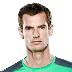
ANDY MURRAY


Image used to do this as this was an image used from Google:

For my stamp series, I decided to base my idea on an Art Movement of the last 200 years, so I decided to focus on the Pop Art era.
CHRIS HOY


Image used to do this as this was downloaded from Google:

The subject of my Pop Art was to commemorate the fact that in 2016 was the fourth anniversary of the London 2012 Olympics.
GREG RUTHERFORD


Image used to do this as this was downloaded from Google:

I picked 7 British athletes for my Pop Art and they came out looking really well and they do have Warhol elements in these such as Colours and composition i.e.
JESSICA ENNIS-HILL


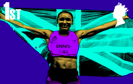


Image used for this as this was downloaded from Google:

The colour series remains the same for each stamp, but I’ve lightened the yellow backgrounds on some to retain the same colour on those athletes with gold medals to show the gold on these medals.
KAT GRAINGER


Image used for this as this was downloaded from Google:

TOM DALEY

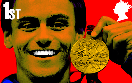


Image I used to do this as this was downloaded from Google:

VICTORIA PENDLETON


Image used to do this as this was downloaded from Google:

WHY DOES TOM DALEY HAVE DIFFERENT COLOURS ON HIS MEDALS AND HOY, MURRAY AND ENNIS-HILL DON’T HAVE MEDALS AT ALL?


For starters, Daley did not win any gold medals at all in 2012, so in this case would be wrong to mislead the audiences into believing that this was the case, so instead I used different colours for his medals and they work really well. In addition to this, I gave him a Yolk Yellow background just to give the design a Pop Arty effect.
Hoy, Murray and Ennis I wanted to make the fact that if I was to design this as a design series based on future anniversaries of London 2012, I would want to design some athletes with medals and some without medals, like the Jess Ennis Hill with the British flag in her hands, it looked busy and signified British pride and their success in the Rio 2016 games.
Hoy and Murray, I wanted them to look dominant, neither look as if they contended in the Olympics in the image of them that I used, this is fine as I had them looking like role models giving true backing to the 2012 slogan for the Olympics, “Inspire a Generation”. Looking at this image of Hoy and Murray could be inspiring to youths to take up sport, paving the way for future GB athletes.
STAMPS: INTENDED AUDIENCE

For their colours and compositions, maybe better suited for a younger audience perhaps, the same as stated before when I was talking a bit about the Mona Lisa artwork.
This could sway even an older audience given the fact that it talks about the Olympics of 2012 and this remains very popular with most audiences around the UK and otherwise worldwide.
The Olympics of 2012 were very popular indeed with various generations, ranging from both the young and the older.
Various British people since 2012 have been doing things to keep the legacy and spirit of the 2012 Olympics alive and my stamp collection reflects this enormously.
INSPIRATIONS FOR MY STAMP PROJECT.


Image sources:
https://www.pinterest.com/pin/106116134943503411/https://berniesoh.wordpress.com/tag/popart/
Andy Warhol’s artwork was a great source of inspiration for my ideas for my stamp collection as I’ve injected Warhol effects into my designs during this project. These are following examples of work either created by Warhol himself or created the Warhol way as my stamps were created.
The compositions are of this effect as is their colours just like Lennon and Monroe here.
BITS THAT COULD BE IMPROVED
I would like to talk about my first idea for my stamps here:
There isn’t too much going on in any of them.
The repetition of the images used to create them.
Portraits work really well in them.
Jess Ennis looked busy and Andy Murray looked clearer.
According to constructive feedback given to me, what was not liked about it was:
Faces could be of more lighter vivid colours.
Taking care of colour choices.
Creating 4 individual stamps in the same dimensions would be better.
WHAT I DID AFTERWARDS
I’ve descaled them to the correct dimension of a basic stamp and explored different colour combinations using the Adobe Color Wheel to explore this further to do this. I do think that this works really well now and have the Warhol effect inside each and every stamp. I am glad as to how these have turned out.
The YouTube video to have helped me to do this is below here:
OLYMPICS
RESEARCH
GLASGOW
Glasgow has been named as one of the top 20 Best of the world places to visit for 2016 by The National Geographic Traveller.
The city is well known for it’s friendliness by the city’s people as it has been voted the friendliest city in the world in a Rough Guides poll.
It has also been named a must visit destination by certain publications worldwide such as the New York Times and The Guardian.
It has earned a reputation as one of the world’s greatest cities and it has been a place described for the traveller as the place to visit for a city break.

Whether you’re here on a city break on your own, as a couple, with friends, family or travelling here on business, there’s something to suit every body’s tastes and budgets.
From Mackintosh to Modern Art, Dinosaurs to Dali, the Tall Ship to Tearooms, Science to Scottish Football, and much, much more you'll be spoilt for choice and can truly make the most of Glasgow's top attractions while visiting the city.

Glasgow’s a UNESCO City of Music, hosting an average of 130 music events every single week.
Glasgow has eight venues in the Top 100 list of places to watch gigs, outside of London, including The SSE Hydro, which is ranked in the top five best arenas in the world, even beating New York's iconic Madison Square Garden!
The music scene spans the spectrum, there is multiple choice from urban and hip-hop, electronica and indie through to classical and celtic. And its fantastic club offering, including Sub Club, The Buff Club and The Berkeley Suite, plays host to a number of world class DJs.

The Merchant City area is home to high-end international designers like Mulberry, Ralph Lauren, Burberry & Agent Provocateur and the city’s West End is a haven for independent retailers, vintage fashion and secondhand bookshops.

Almost 25 years after being named 'European City of Culture', Glasgow’s arts and culture scene has never been stronger! There are five internationally renowned performing arts companies based in the city, including the National Theatre of Scotland & Scottish Ballet.
No fewer than six Turner Prize winners and twelve Turner Prize nominees have hailed from, trained or worked in the city. And Glasgow’s Tramway hosted the 2015 Turner Prize – the first time it has been to Scotland!
The Art Nouveau magic of the city’s most famous son, Charles Rennie Mackintosh, can be seen across the skyline, including at the iconic Glasgow School of Art.
And the city’s renowned for its remarkable museum offering, including the stunning Kelvingrove Art Gallery and Museum, which has welcomed over 10 million visitors since a major revamp in 2006 and the Zaha Hadid-designed Riverside Museum, voted 2013 European Museum of the Year.

With almost 1,800 cafes and restaurants listed for the city on TripAdvisor, it’s no surprise that Lonely Planet describes Glasgow as ‘the best and most eclectic dining city in Europe.
You can literally eat (and drink) your way around the world here! It could be cupcakes during a day of shopping, cocktails before a night at the theatre, a few craft beers on a brewery tour or a fabulous meal to mark that special occasion. And there is also no better place to sample some of the finest Scottish produce, including mussels, oysters and langoustines, at some of the city's first-class Scottish and seafood restaurants.

One of the great things about Glasgow is its compact size - you can see a lot of the city in a short space of time. It also has some very distinct neighbourhoods that you can explore. If you’re looking for the perfect place to people-watch, head for the trendy West End where you can also experience it's ‘Cool Quarter’ of Finnieston, which is buzzing with bars and independent shops.
If you love the energy of a flea market, pay a visit to ‘The Barras’, in the East End. Or head over the river to the city’s South Side, where the sprawling Pollok Park offers a woodland oasis alongside the beautiful Pollok House.
Further afield, ancient castles, picture-postcard distilleries, tranquil lochs, outstanding golf courses and miles of unspoilt coastline are all just a short journey from the city centre - incredibly, you can get to Loch Lomond, gateway to the Scottish Highlands in only 30 minutes.

OLYMPIC BID-BACKGROUND OF LOGO


The shape of this logo was to represent a thistle with a Celtic knot at the bottom representing Scotland and Glasgow alike as the top of the thistle is the very same shape of the Hydro building and the thistle is the Flower of Scotland and also connecting the logo with Scotland’s Celtic heritage as well as it’s British heritage.
The colours of the logo represent that Great Britain will be the host country for this event since Great Britain is the participating country for any Olympic games. This matches the colours of the Union Jack flag of the UK.
The typeface is of a Celtic outlook and I think that this matches the design of the logo.
OLYMPIC LOGO-WHAT IS WRONG?
What is wrong with this logo was that maybe the colours could have been a bit more even going around the knot perhaps. I could not work my way round this to make this possible, so I maintained the flow throughout.
Secondly, the white triangle inbetween the red and blue bottom is easily noticeable on a darker background. Note: This is not noticeable on a white background.
I like the idea of the 2 doves around the logo as well, as the doves are a significance of peace and unity in the Olympic movement. I thought this a good idea to add this in.
I drew the Celtic knot at the bottom of thistle using this YouTube video here:
INSPIRATION FOR LOGO
This I thought looked like a great example for my logo for the Glasgow 2024 Olympics.

I injected my own elements into this such as the Hydro shaped top of the thistle, connecting the logo to the host city.

The 2 top leaves could represent Olympic athletes, I put my own take here by adding ellipses as heads to make them look like real athletes.
The two dove shaped leaves on the side were a significance of birds (doves). I incorporated these into my logo as well but gave them eyes obviously.
The two leaves by the stalks could signify swimmers given the way the leaves are sticking up in the air, this was possible by adding ellipses to these as well.
THE CELTIC KNOT

In added this to the bottom of my logo as I feel that this could signify peace and unity also as this is the Olympics.
I also thinks that this works well in the logo as this makes the connection of Scotland’s Celtic heritage, so it was appropriate for me to add this in to the logo.
Overall I think that this logo is connected to Scotland, Glasgow and Great Britain alike for the landmark (Hydro Building) which connects Glasgow, the thistle and the Celtic knot is a connection of Scotland’s heritage and the colours of the logo represents the Union Jack flag of the UK, connecting it to the host country of the Olympics which is Great Britain.

AUDIENCE
The main target audience for this logo would be members of the British Olympic Association who would probably like and admire this logo for it’s use of colour which represents as stated the Union Jack.
It also matches the colour scheme of the lion logo for Team GB and possibly every Team GB fan in the UK and British sporting fans worldwide.
People in Scotland would probably like the logo as well (maybe just the Blue and White perhaps), actually they would like it as this makes the connection between Scotland and GB in general.
BITS THAT COULD BE IMPROVED-OLYMPICS

I would like to talk about my first idea for my Olympic logo here:
Looks finished and complete
Good sense of Elegance
It looks clean
and symmetrical
Good Color choices
Doesn’t look complicated.
According to constructive feedback given to me, what was not liked about it was:
The typeface used here as it detracts from the logo
The Olympic rings would have looked better in the circle.
The colour theory could match better to the thistle and no use of gradient colours.
Looking at this logo, it could have looked a whole lot better…

I made it look better by doing the following changes:
I added a Celtic knot at the bottom of the logo to connect the logo to Scotland’s Celtic heritage.
I now added the Olympic logo into the circle as advised in the constructive feedback given to me by others.
The birds on the left and right of this logo represent peace and unity as this is the way in the Olympic world.
I made the thistle top above here look tidier as the one previously shown looked a bit crooked in areas.
The colours are now flat as I took out the gradient installed in the logo. This gained the approval of those who gave me the feedback before.
The typeface now matches the logo and this also represents Scotland’s Celtic heritage.
MASCOTS-WHICH LOOKS BETTER?


Gordania represents Great Britain and Glaschu represents Scotland due to their colours. Both mascots have the Olympic colours for hair. I think that this works really well here.
These unicorns have been given a fresh new outlook, now I could have drawn a real unicorn and made it look pretty and nice, but I wanted to give it a fresh new outlook and give it new ideas as to how a unicorn should look.
The feet on the unicorns, as for the blue and white one, I deemed it appropriate to give this mascot the same colour as it’s body as white is one of the colours and the feet would be hardly recognisable.
All in all, I think Gordania stands out more due to the increase in colour combination and both I think stand out really well.
YouTube video for Unicorn illustration below here:
Color inspirations for mascots and logo in general:


Image sources: Union Flag: https://en.wikipedia.org/wiki/Union_Jack Flag of Scotland: https://en.wikipedia.org/wiki/Flag_of_Scotland
OVERVIEW
•All in all, I think that I did really well in this unit. Some mistakes along the way, but I did my best to correct those in the best possible way and I think that this is a goal I succeeded in doing.
•The skills I’ve learnt in this unit, I plan on using in future units and I must work a bit more on being consistent in places and learn more about semiotics and so on.
REFERENCES
Anon, (2017). [online] Available at: http://www.mirror.co.uk/sport/other-sports/athletics/jessica-ennis-hill-hints-retirement-8628182 [Accessed 9 Jun. 2017].
Berniesoh.wordpress.com. (2017). Popart – English 101- Bernie. [online] Available at: https://berniesoh.wordpress.com/tag/popart/ [Accessed 9 Jun. 2017].
Ely Standard. (2017). TAKE FIVE: Picture Portrait of Mildenhall’s Golden Girl Victoria Pendleton who has taken London 2012 by storm. [online] Available at: http://www.elystandard.co.uk/sport/take-five-picture-portrait-of-mildenhall-s-golden-girl-victoria-pendleton-who-has-taken-london-2012-by-storm-1-1473214 [Accessed 9 Jun. 2017].
En.wikipedia.org. (2017). Color theory. [online] Available at: https://en.wikipedia.org/wiki/Color_theory [Accessed 9 Jun. 2017].
En.wikipedia.org. (2017). Flag of Scotland. [online] Available at: https://en.wikipedia.org/wiki/Flag_of_Scotland [Accessed 9 Jun. 2017].
En.wikipedia.org. (2017). Mona Lisa. [online] Available at: https://en.wikipedia.org/wiki/Mona_Lisa [Accessed 9 Jun. 2017].
En.wikipedia.org. (2017). Union Jack. [online] Available at: https://en.wikipedia.org/wiki/Union_Jack [Accessed 9 Jun. 2017].
Glasgow Architecture. (2017). The Hydro, Glasgow - SECC Arena - Glasgow Architecture. [online] Available at: http://www.glasgowarchitecture.co.uk/the-hydro [Accessed 9 Jun. 2017].
Glasgow, P. (2017). People Make Glasgow | Official Guide to the City of Glasgow. [online] Peoplemakeglasgow.com. Available at: https://peoplemakeglasgow.com/ [Accessed 9 Jun. 2017].
Gov.uk. (2017). Grant Shapps offers 'Portas-Plus' plan to revive ailing high streets - GOV.UK. [online] Available at: https://www.gov.uk/government/news/grant-shapps-offers-portas-plus-plan-to-revive-ailing-high-streets [Accessed 8 Jun. 2017].
HuffPost UK. (2017). How Much Would You Pay To Get Your Children Into A Good School?. [online] Available at: http://www.huffingtonpost.co.uk/2013/07/23/how-much-would-you-pay-to-get-your-children-into-a-good-school_n_7385928.html [Accessed 9 Jun. 2017].
It’s Nice That. (2017). Designing London 2012: The Wolff Olins logo and all THAT controversy. [online] Available at: http://www.itsnicethat.com/articles/designing-london-2012-logo [Accessed 9 Jun. 2017].
Kidd, D. (2017). Katherine Grainger ready to become Team GB's most decorated female Olympian. [online] mirror. Available at: http://www.mirror.co.uk/sport/other-sports/athletics/katherine-grainger-begins-quest-become-8571826 [Accessed 9 Jun. 2017].
Krabi.uk. (2017). Thai postage stamps depict Thailand’s culture and history | Krabi – Everything about Krabi Thailand. [online] Available at: http://www.krabi.uk/thai-postage-stamps/ [Accessed 9 Jun. 2017].
Mail Online. (2017). A new golden age is born... Rutherford, Ennis and Farah give athletics new lease of life. [online] Available at: http://www.dailymail.co.uk/sport/olympics/article-2184130/London-2012-Olympics-Golden-Brits-Jessica-Ennis-Mo-Farah-Greg-Rutherford-start-new-era.html [Accessed 9 Jun. 2017].
Mail Online. (2017). This medal's for you Dad! Poster boy Daley delivers bronze in diving thriller. [online] Available at: http://www.dailymail.co.uk/sport/olympics/article-2187152/London-Olympics-2012-Tom-Daley-wins-diving-bronze.html [Accessed 9 Jun. 2017].
Mcescher.com. (2017). M.C. Escher – Relativity. [online] Available at: http://www.mcescher.com/gallery/back-in-holland/relativity/ [Accessed 8 Jun. 2017].
Museu.ms. (2017). Daily art story: Spring in art – our favorite spring landscapes. [online] Available at: http://museu.ms/article/details/108530/daily-art-story-spring-in-art-our-favorite-spring-landscapes [Accessed 9 Jun. 2017].
newsbook. (2017). “Peppa Pig” u “Bob the Builder” fuq il-bolol. [online] Available at: http://www.newsbook.com.mt/artikli/2014/1/4/%22peppa-pig%22-u-%22bob-the-builder%22-fuq-il-bolol.13532/ [Accessed 9 Jun. 2017].
Pinsdaddy.com. (2017). Mona Lisa Pop Art Pictures to Pin on Pinterest - PinsDaddy. [online] Available at: http://www.pinsdaddy.com/mona-lisa-pop-art_VSl8vS%7CW3Sch96wm7HCgAqtbiS2wCa2b5715mSj%7CdAQ/ [Accessed 9 Jun. 2017].
Pinterest. (2017). Australian Stamps. [online] Available at: https://www.pinterest.com/suzyqt1111/australian-stamps/ [Accessed 9 Jun. 2017].
Pinterest. (2017). British Stamp Design. [online] Available at: https://www.pinterest.com/eileenfinney/british-stamp-design/ [Accessed 9 Jun. 2017].
Pinterest. (2017). V.I.Ps. [online] Available at: https://www.pinterest.com/pin/106116134943503411/ [Accessed 9 Jun. 2017].
Rmspecialstamps.com. (2017). Buckingham Palace. [online] Available at: https://rmspecialstamps.com/collections/buckingham-palace/ [Accessed 9 Jun. 2017].
Saleoilpaintings.com. (2017). summer time field painting - various artists summer time field paintings for sale. [online] Available at: http://www.saleoilpaintings.com/paintings/various-artists/summer-time-field.html [Accessed 9 Jun. 2017].
Saleoilpaintings.com. (2017). william trost richards along the beach towards sunset painting ID 22310 - william trost richards along the beach towards sunset paintings for sale. [online] Available at: http://www.saleoilpaintings.com/paintings/william-trost-richards/william-trost-richards-along-the-beach-towards-sunset.html [Accessed 9 Jun. 2017].
Shutterstock.com. (2017). Thistle. [online] Available at: https://www.shutterstock.com/tr/image-vector/thistle-149137796 [Accessed 9 Jun. 2017].
Sportle.tv. (2017). Sportle: Andy Murray vs Jo-Wilfried Tsonga at The Wimbledon. [online] Available at: https://www.sportle.tv/event/andy-murray-vs-jo-wilfried-tsonga-at-the-wimbledon/18526 [Accessed 9 Jun. 2017].
Tate. (2017). Pop art – Art Term | Tate. [online] Available at: http://www.tate.org.uk/learn/online-resources/glossary/p/pop-art [Accessed 9 Jun. 2017].
Tlaworldwide.com. (2017). Talent | TLA. [online] Available at: http://tlaworldwide.com/talent/ [Accessed 9 Jun. 2017].
Unwinedpainting.com. (2017). » unWined’s Autumn Art Favorites. [online] Available at: https://unwinedpainting.com/art/autumn-art-favorites/ [Accessed 9 Jun. 2017].
Wallpaperscraft.com. (2017). Download Wallpaper 3840x2400 Landscape, Painting, Art, Winter, Snow, River Ultra HD 4K HD Background. [online] Available at: https://wallpaperscraft.com/download/landscape_painting_art_winter_snow_river_48071/3840x2400# [Accessed 9 Jun. 2017].
Wells, E. (2017). Time and Place: Katherine Grainger. [online] Thesundaytimes.co.uk. Available at: http://www.thesundaytimes.co.uk/sto/style/homes_and_gardens/time_place/article1301067.ece [Accessed 9 Jun. 2017].
Wikiwand. (2017). 大韓民國國旗 | Wikiwand. [online] Available at: http://www.wikiwand.com/zh-hk/%E5%A4%A7%E9%9F%93%E6%B0%91%E5%9C%8B%E5%9C%8B%E6%97%97 [Accessed 9 Jun. 2017].
Wood, A., Mitchell, B. and Henderson, S. (2017). Animated Kids TV Favourites Hit Royal Mail Stamps - Skwigly Animation Magazine. [online] Skwigly Animation Magazine. Available at: http://www.skwigly.co.uk/animated-kids-tv-favourites-hit-royal-mail-stamps/ [Accessed 9 Jun. 2017].
YouTube. (2017). Create Andy Warhol Style Pop Art Portrait using Photoshop - NowPhotoshop. [online] Available at: https://www.youtube.com/watch?v=q_u-tMhi2I4 [Accessed 9 Jun. 2017].
YouTube. (2017). How to Draw a Celtic Knot in Adobe Illustrator. [online] Available at: https://www.youtube.com/watch?v=878vLGfpatI [Accessed 9 Jun. 2017].
YouTube. (2017). Kawaii Speed Drawing - Lola is a Unicorn. [online] Available at: https://www.youtube.com/watch?v=zBuzIAa-l8E [Accessed 9 Jun. 2017].
Comments