Website Designs Over The Years Evaluation
- Mar 10, 2017
- 15 min read
April 2015-THE BEGINNING
As I was approaching the final 8 weeks or so in my Creative Media Production course, I was about to face my biggest ever challenge yet, how to build a website from the word go. We were given 2 options in the group, one was to completely design your very own website, or take the easy way out and do a website following the task sheet given to me. Now since that I was just a basic level 2 student at the time, I am going to just going to copy and paste the evaluation below here that I've saved in Microsoft Word.
This is the evaluation for my first Web Design unit that I did in level 2:
For the web design assignment I was assigned to do, I chose to do the X-Vision website which was suggested in the assignment for this unit. By making this decision however, I felt that it was the right one as I have never used Dreamweaver before and I wanted to start off on an easier note, rather than go way ahead of myself on such a difficult assignment. However I made the right decision as this was a starting point as I now aim to do a lot more of this in the future.
DID THE FINISHED DESIGN FULLY SATISFY THE PROJECT BRIEF?
On a scale of 1 to 10, for the work that I did I would give it 5 as it would be half and half since this is the first time I’ve done something as creative as this. However as I look at how the website is laid out, I think that I would give it number 7 as I feel as I have given the website a little bit of everything, ranging from recipes and sports etc. On the whole I feel as the finished design has fully satisfied the project brief given to me.
HOW MY IDEAS CHANGED/EVOLVED THROUGH THE PROCESS OF PRODUCTION
I followed the assignment brief to the letter, but I added an additional page dedicated to UK travel, in the hopes of inspiring people who never visited the UK before to visit the UK and see what the UK has to offer. Otherwise I did not do much else to it in terms to changing my ideas as I stuck to the assignment brief and what suggestions it had.
STRENGTHS AND WEAKNESSES
The website I thought looked quite good and I got some positive feedback from my fellow students and tutor. There were some weaknesses though and things that needed to be improved. These I have stated on a separate sheet of paper.
HOW HAPPY AM I WITH THE FINISHED WORK?
Upon viewing the finished piece after presentation, I think I am completely satisfied with how I did the work and gained confidence along the way with using Dreamweaver for the first time. Dreamweaver is a hobby that I have taken up to doing in my spare time but I feel as if I have a bit to go yet before I fully get the hang of it.
CONCLUSION
Now that I have done the work, I feel happy and refreshed and hopefully that one day all this hard work will eventually pay off. I think that I have learnt a lot using Dreamweaver, from linking images to pages and embedding YouTube videos etc. I really enjoyed doing this project and I would not mind doing this project again if the opportunity ever came about.
This is my evaluation for my Web Design assignment.
This was word processed in June 2015 and I have no screen-shots of the work in progress, this site doesn't exist now as this was domain space provided to me by my tutor at the time who no longer works at the college, but I might have the files saved on my hard drive that I could take a screen shot of, I shall see. And I do indeed have the files saved and I am going to only going to add one screen shot of the home page of the site done and at the time I thought it looked really good.

Yep, here it is in it's infernal glory. Nice looking, but it is a non existent site now as when the tutor left, the domain name expired and that was that, but it can be published in the future if desired but it is unlikely that this will happen.
WEB AUTHORING UNIT 2016-2017
One year later I was assigned in the 3rd semester (2nd year) of my course to do this all over again, from the code up, here is how it all went for me.
OVERVIEW
•I’ve been assigned to put together a portfolio of work to show off my skills as a designer.
•I’ve found this to be an easy-going process, with a few little mistakes along the way which I did my best to correct.
•I am going to talk a little about doing a tutorial provided by Adobe called Katie’s Kitchen. I won’t go into too much depth here, I’ll just use this as a little introduction mode. This is the link for the tutorial below here:
https://helpx.adobe.com/uk/muse/how-to/create-website.html
WHICH SHALL I USE TO CREATE MY WEBSITE?


ADOBE DREAMWEAVER
Creating a website the hardway by writing it in code view and constantly changing the style of how it’s elements appear such as sizes, colours and so on.
ADOBE MUSE
Creating a website without writing in any coding and basically scaling images and positioning things yourselves using the click and drag approach.
WHAT SHALL I USE TO CREATE MY WEBSITE WITH THEN?
Dreamweaver for me is quite a headache and a bore as this is the hardest way of creating a website as this will involve going back and forth to the styles windows and typing in measurements of images and codes for colours, so in this case I am going to persevere with using Adobe Muse to do my website.
KATIE'S KITCHEN-THE WORK IN PROGRESS

I got started by doing a tutorial provided by Adobe called Katie’s Kitchen. I watched the videos online and created the webpage as instructed on the 5 videos below here:
How to Create a Website with Adobe Muse CC (1/5) | Adobe Creative Cloud
How to Create a Website with Adobe Muse CC (2/5) | Adobe Creative Cloud
How to Create a Website with Adobe Muse CC (3/5) | Adobe Creative Cloud
How to Create a Website with Adobe Muse CC (4/5) | Adobe Creative Cloud
How to Create a Website with Adobe Muse CC (5/5) | Adobe Creative Cloud
I followed all instructions given to me by a woman called Danielle Beaumont to the letter and I found this a pretty much straight forward process as she was very specific in delivering her instructions.
I found parts of this a struggle though as I was going in-between the website where the tutorial is placed and the actual Muse file itself to do the work in question. I might have found this easier if I accessed the website on another device and carried out the instructions regardless.
MAIN, MASTER AND INTERIOR PAGES
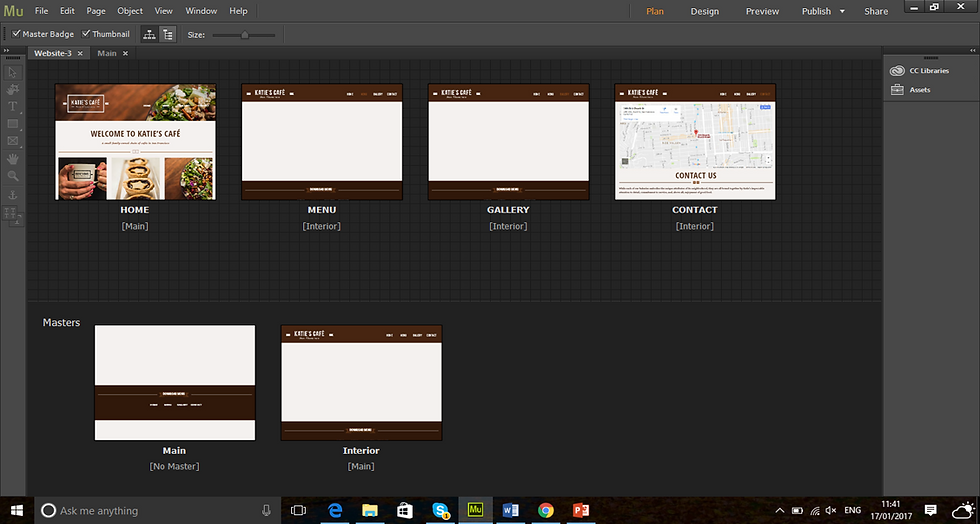
Efficiently learning of work by adding elements such as navigation, logos and other elements that one would want to apply to every page as this is the case here with the layout of Katie’s Kitchen website.
To look at it here, you wouldn’t think that it would look good once published to the web, so if I was to preview the page in the browser…
MAIN, MASTER AND INTERIOR PAGES

To look at the site map above, the main page looks really untidy such as the big white gap down here below, but…

This is the main page in browser mode, it looks empty right now, only containing the footer such as navigation. It looks really good at the moment presentation wise, but would look better if content was added.
NOW I WOULD LIKE TO TALK ABOUT MY DESIGN
•I am designing a portfolio website detailing my skills that I have picked upon for this unit and as a graphic designer in general.
•I am going to use Muse for this design as I find Dreamweaver a bit of a pain to use, I will learn to use Dreamweaver at a much later date for future web designs.

This is the first attempt of putting together a website with Adobe Muse. It looks alright, as a matter of fact it would look great if I was to take out the “Joe’s Portfolio Site” part as constructive feedback has deemed this to be too casual. I could change this to my name but I even think that this is too casual and maybe another colour would work well, say to match the background i.e. grey. Otherwise I think it looks really good and works well for a website.
MISTAKES SPOTTED

Another fact spotted whilst in the production process of the website in progress is that the text in this webpage is all conformed as a image file as opposed to highlighting the actual text in question. Also I think that the description of the work in the image slider is a bit outplaced and makes the work look odd in my opinion. I will work on making this right for future website units.

A small blip here is the grey rectangle with the website logo in it and nothing else, this makes this part of the website look rather lonely and empty as opposed to the rest of the site in question. Otherwise everything is fine as the logo slide is nicely positioned here.

Another mistake spotted is this little white gap here below the black background, this is because that I drew in a big black rectangle to fit the entire page rather than using the browser fill option. Also I need to add a bit more contact information for clients to contact me with the possibility of doing some work. This version hasn’t got this in.

This is the evidence of the fact that I made this error. Later on down the line I realised as stated that I did not need to do this.
HOW I MADE IT MORE INTERESTING

•This is the new look page of the website that I created.
•I made this possible by creating myself a little logo using my initials to match the colours used on the site.
•I’ve added 2 diagonal lines going straight with an ellipse on both ends of the lines.
•There is a footer with links to the home pages on the bottom right hand corner.

To look at this new look site now, I think that I have made this look rather interesting now as opposed to the way it had looked before. It looks snazzy, friendly and has a sense of warmth to it and looks more like a designer website all the time. I followed along to the Katie’s Kitchen video tutorial and did what I was told, but added my own content more or less. This was a great source of help to me in this.

The diagonal lines with the logo in-between doesn't make the grey rectangle above look so lonely now. I also think that the navigation links within the rectangle also give a nice touch to the site in question. I think that it was appropriate to give the pages a small annotation of my work detailing as to what the page is about as I didn’t do this in the previous attempt. I think that this looks more friendly to my web visitors.

One thing that I've noticed that is there isn’t any copyright info in any of the pages of the new site, as there is on the old site. Maybe it would be a good idea to do this.


I have now added the copyright info. I didn’t add very much, but if I did it right, I think that it would work.

I have scaled images in the site I think to quite a good enough standard. I will discover this once I publish the site via business catalyst to preview how it came out. But I think that it would be OK once viewed on the big screen.

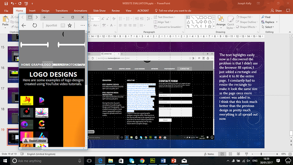
The text highlights easily now as I discovered the problem is that I didn’t use the browser fill option, I just added a rectangle and scaled it to fit the entire page. I constantly had to resize the rectangle to make it look the same size as the page once more content was added in. I think that this look much better than the previous design as pretty much everything is all spread out now.
The scaling of the webpage still comes with issues however, as I can see how horribly overlapped all the links are on top of each other in the grey rectangle. I might need to look into this further to see how that this can be resolved. I think that I will have to look deep into this and see what the problem is, but otherwise everything else is fine.
HOW DOES IT WORK ON OTHER DEVICES
PHONE


Unfortunately it doesn’t look the way I wanted it to look. I don’t know why that this has happened. So far it only looks compatible on the big screen i.e. laptop. To look at it on the laptop, it looks great as stated, but the scaling of the page makes it look terrible as everything overlaps in some weird way.
TABLET


To look at it from my iPad mini, it doesn’t look too bad. These are images of my iPad rotated portrait and looking at them, they look slightly better, but not in the way that I would like them to.


These images of my iPad mini now rotated landscape show the site in not such a bad way. Everything looks spaced out really well. I must find a way that it would look better if I was to view the site rotated portrait though.
THERE IS A LOGICAL EXPLANATION...

This is a screen shot of the video tutorial of the Katie’s Kitchen creation. According to this screen shot, the cause of my problem is that in this instance, you can select whether you would like to create a site for desktop, tablet or phone. Danni Beaumont selected the desktop version to do this and I followed along with her. However, since I recently updated the Muse CC program a few times as the Katie’s Kitchen tutorials might be a couple of years old…

As of now, when I go to create a new site, this does not allow me to choose the option for a Desktop, Tablet or Phone. I would have to look into this further on as I think that this is pretty odd that this has happened.
INSPIRATION...

I liked very much the way the Lee Mason created his website of his portfolio. Only used very few colour combinations, just like I did and used good hierarchy and composition.

Mason wrote a few lines based on his ideas as well, I decided only to dedicate a page for writing with and only show my work with few annotations accompanying them. I used Black and Grey for my site which I am happy with whilst Mason used Black and White for his.
Source for Site: http://www.leemasondesign.com/
MY NEWLY DESIGNED WEBSITE
I used Dreamweaver this time to create a brand new website from scratch, as I discovered that to get the website to function properly on Muse, I had to add break it points to get the actual site to function properly. This was NOT explained on the updated Adobe CC 2017 as they change their software functions a whole lot more than I change my socks, it was easier to do this on one package over than the other and I didn't know where I properly stand with them. Anyway here are some screenshots of how this had turned out:

This is the homepage of my new website. It looks far more slick and minimal in terms of colors. Not too much going on which I am happy to say, but it will do me for a nicely created portfolio of work.

Students in my course like the way my website looks, one of them said that they did not like the grey in my Navigation bar below here. I might take it out and judge for myself how it is going to look, but for now this remains the lowest of my list of priorities.

In my Illustration page, there is work that is NOT showing at all as shown above. Such as the Four seasons work.

Yep as you can see above, I wonder why this is…

For the Olympic Illustrations though, everything is fine by the looks of things, which I am glad about.

Everything else in this page is fine though…

Except this image looks elongated height wise

The Copyright info and the footer navigation don’t meet the exact same line as each other here for some reason.

The typography page is fine and the imagery in this page is in good resolution.

All imagery is in good quality here. I am liking this page so far.

The footer remains a problem above as seen with the Copyright and the Navigation.

The Photography page is in tip-top condition as shown above. No problems here.

Everything is fine in the Photography page.

The Branding page is also fine as well. Everything nicely stored.

Everything stored nice and neatly and in good quality.

Advertising looks OK, even the footer is correctly aligned with each other. There is a reason that this page is lower than all the rest…

So far this is the only webpage that I decided to make the images pop out as all the others are all just images that sit in the page. I will fix that up in due course.

The App Design page looks really good, especially the iPhone mockup images.

Even the mockup iPads look good here on this page and the content they store.

The Mary Rimington Apps and the footer look good here. No problems with the App Designs page.

The About Me page looks really good, not much to tweak here. Where it says, “Wanna talk, click here to contact me” the viewer of the site clicks on the word here to take them to the contact page, hence the reason of all the spacing between the words click and to.

The content in this page is fine, except it looks a bit sloppy and the contact form is non functionable. I must fix this up before showing this to potential clients.
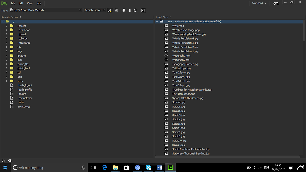
But to make all of this possible, I had to buy up webspace for my site and link this work to that space in question. It was an easy straight forward enough process to go by and here is how I went by doing this:

I am buying the webspace for my website. I cannot host my website without this space.

The webspace is bought and soon ready for me to use my domain name. This process could take some time.

I am setting up the posting process of the website to show the world.

All this stuff is what is going to be visible on the site.
Everything here is all good to go.
Here is a new sitemap of my newly done website.

This is a sitemap detailing where everything is on the website. From my Wix blog to my Social media links.
As mentioned earlier in constructive feedback given to me by a fellow student, it is mentioned that the grey rectangle in the image below here

where the navigation is, did not look right. So what I did was that I took it out below here:

And I now think that it looks good. So what I will do is that I will take out the grey rectangle whenever I get the time to do so and it might look a whole lot better.
Meanwhile here are the digital sketches of the website below here:

Homepage Sketch, designed using Illustrator.

Illustraton Page Sketch, designed using Illustrator.

Typography Page Sketch, designed using Illustrator.

Photography Page Sketch, designed using Illustrator.

Branding Page Sketch, designed using Illustrator.

Advertising Page Sketch, designed using Illustrator.

App Designs Page Sketch, designed using Illustrator.

About Me Page Sketch, designed using Illustrator.

Contact Page Sketch, designed using Illustrator.
I will submit the sitemap and sketches in a more higher resolution standard to my tutor via Dropbox.
HOW IT ALL WENT?
All in all, I think that my Dreamweaver skills have improved greatly. I really should have used this as opposed to using Muse due to the way that it looks once it was complete, so I am going to reject that particular site and focus more on the one I created over the past few months using Dreamweaver as I found that easier than I thought.
My web design skills I feel have improved and I feel as if I am now getting the hang of things a lot more clearer now. Although I have a long way to go as far as Javascript is concerned as this is far out of my league right now. I could have learnt a whole lot more about codrops and that kind of thing, maybe next time as my website looks nice and simple for the moment I think.
I could have made more of the images pop out as I have done in the advertising page, but due to lack of time and other assignment commitments have made this impossible, but if I am given another chance to do this unit again, I will learn a lot more about codrops and all other website techniques such as image pop outs and so on.
Finally my color combination on the website is inspired by elegance and excellence as stated by the color chart, that is what the two colors on the website signify. I found this challenging in parts, but have learnt a lot so far and will reflect this upon further website designs.
Evaluation Concluded.
REFERENCES
Dloadfacil.blogspot.co.uk. (2017). Download, uma coisa séria. [online] Available at: http://dloadfacil.blogspot.co.uk/ [Accessed 12 May 2017].
Helpx.adobe.com. (2017). How to create a website with Adobe Muse | Adobe Muse CC tutorials. [online] Available at: https://helpx.adobe.com/uk/muse/how-to/create-website.html [Accessed 12 May 2017].
Mason, L. (2017). Lee Mason Design - Freelance Graphic Designer London. [online] Lee Mason Design. Available at: http://www.leemasondesign.com/ [Accessed 12 May 2017].
Pxleyes.com. (2017). Let It Rain Drawing Contest (18564), Pictures Page 1 - Pxleyes.com. [online] Available at: http://www.pxleyes.com/drawing-contest/18564/let-it-rain.html [Accessed 10 Mar. 2017].
ramadhan, d. and profile, V. (2017). sdi indonesia. [online] Sdiindonesia.blogspot.co.uk. Available at: http://sdiindonesia.blogspot.co.uk/search/label/multimedia [Accessed 12 May 2017].
YouTube. (2017). How to Create a Website with Adobe Muse CC (1/5) | Adobe Creative Cloud. [online] Available at: https://www.youtube.com/watch?v=o9vySIZPyx0 [Accessed 12 May 2017].
YouTube. (2017). How to Create a Website with Adobe Muse CC (2/5) | Adobe Creative Cloud. [online] Available at: https://www.youtube.com/watch?v=qJWxWdz0wCQ [Accessed 12 May 2017].
YouTube. (2017). How to Create a Website with Adobe Muse CC (3/5) | Adobe Creative Cloud. [online] Available at: https://www.youtube.com/watch?v=kILy6ZGhGPk [Accessed 12 May 2017].
YouTube. (2017). How to Create a Website with Adobe Muse CC (5/5) | Adobe Creative Cloud. [online] Available at: https://www.youtube.com/watch?v=GS-EzdGuG8E [Accessed 12 May 2017].
YouTube. (2017). How to Create a Website with Adobe Muse CC (4/5) | Adobe Creative Cloud. [online] Available at: https://www.youtube.com/watch?v=S7aCVa7OWwM [Accessed 12 May 2017].
символ"., &., «Петух», а., Обезьяна.Векторный символ, и., символ., О., Акварельный рисунок, .., Акварельный рисунок, .., рисунок., О., рисунок., П., рисунок., М., Баннер новогодний. Снеговики, ё., Иллюстрация., Д., Дед Мороз, ё., иллюстрация., Д., Иллюстрация., Р., рисунок., Р., иллюстрация., О., иллюстрация., О., иллюстрация., О., снежинками., Г., снежинками., Ч. and иллюстрация., О. (2017).Search photos by swetofor. [online] Fotolia.com. Available at: https://www.fotolia.com/p/204291696# [Accessed 10 Mar. 2017].
Comments