Evaluation for Project Design, Implementation and Evaluation
- Mar 7, 2017
- 50 min read
This unit began with me making four movie mock up posters of the same movie, the only thing that will change is the genre. The movie I chose to do is called Two Birds and it took me some considerable time deciding on what images to choose from on Google, this is where I will be sourcing my images from.
I came across these four images below here on Google for their visual consistency:


The images I found here look really good for the film posters of my choosing. The lovebirds representing love, the sky representing love being in the air and freedom, the married couple representing romance and the aeroplane representing travel. I can do a lot with these photographs and I can make these images look different than romance and lovey dovey movie type if you know what I mean. I will add screenshots of the work in progress.
The work then began by experimenting with the above images. The first poster was going to be based on a romantic comedy and so I began by implementing the following:

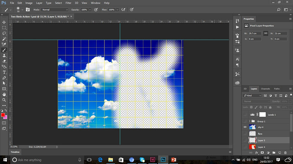
I used the sky image in this poster to indicate freedom and echoing the philosophy, Love is in the air. Love definately is in the air in this movie poster. I think that this looks really significant and it is too early at this stage of the poster production to know whether my intentions are going to come to fruition at this stage, but we shall have to wait and see. So far though it is looking good and the pink square is there for a purpose and all.

The two lovebirds are in now, I think that it is looking cute and loving at this stage, especially how the heart is drawn around the birds. The colors match as well for their vibrance and warmth and so far it is coming along nicely I think.

I like the idea of the married couple in this poster as well as it is supposed to be a romantic chick flick and a comedy rolled into one, the birds could stand for the fact that they could be pets of the newly romantic couple and so far it is coming along really nicely. The poster is almost complete at this stage and is looking good.

The poster is now done and the gif plane that went in was part of the movie logo's title signifying the fact that birds can fly and the married couple are jetting off on their honeymoon. To look at it now, I think that I made a really good job of the movie poster. The process is harrowing to the fact that I've now 3 other posters to design with the same images and the movie title to boot. I think that I am going to find this complicated, but I am sure that I am going to pull it off one way or another.
I thought of another cool genre for this movie title that does not have to be a romantic love story by any means whatsoever, but a western movie. I am going to create this movie title using this YouTube video tutorial below:
I am going to create the poster by following the instructions given to me on the video, but adding elements of my own to this to make it look my own work and not be designing it in the same style as the designer on the video. I began by doing this:

I downloaded this link from YouTube at the link provided at the video's description. It looks like a sign for a saloon in the wild west in many different western movies. But I do think that the white around the cartouche looks a bit weird, so I went about removing it by doing this:

I changed the blend mode to multiply to remove the white background around the cartouche which now doesn't look weird anymore which I can happily say. I am also adding traces of red to signify blood as the movie in question is supposed to be a violent bloody western. So far it looks not so good, but it is early moments yet. Only time will tell how the production will come along.

I now used one of the images I downloaded from Google to put into the poster background. I experimented many different Photoshop techniques to make it look significantly like a Bounty poster of a wanted person or people that are seen on many of the westerns. So far it is looking not like the result I want it to, so I shall experiment further.

This is what I made it look like by temporarily hiding the red shades so I could see what it would look like without the bloody texture surrounding it. I think it would look quite bland in this case, so would experiment with the blood further on.

I added the Two Birds to look as if they would be painted onto the wooden texture in addition to the work done on the screenshot above. It now looks to me that it is no longer a violent bloody western, so I am going to have to find a way to cover up the vibrant colors on the birds and make it look like the blood thirsty western I am intending it to look like.

I readded the bloody texture to the poster in question and now most of the pinks and greens are fading away into a sadisticly dark red signifying the bloody outcome I am desiring for the poster. It is showing it's pedigree at this stage and slowly the outcome I am hoping for is coming along, very slow, but very sure.

Now the birds can be visible, but are now dark red and black and multiplied into the sequence. I added a black background with red bloody drops all over. It is looking very much the result I am hoping for. I know it looks weird that there are few red traces around the couple as the image should be soaked in blood at this stage, I think it appropriate for the picture of the couple to be dried out as to have the image of them showing and the blood to be splattered behind the image.

The poster is complete at this stage. However to look at it now, I think that it looks weird that the image of the couple looks inconsistent and not realistic enough, so I took it upon myself to do this:

I painted over the layer mask and now it looks real enough. I used the airplane gif image for the blood squirting between the words Two and Birds, which is also realistic enough for a violent bloody western. The bloody texture was used with the help of the sky image downloaded from Google.
So far I am finding it easy enough to do, but I have 2 more to do now and I am beginning to find it easy enough to do, but time will only tell if this is the case.
I am now creating an action packed adventure of the Two Birds movie. The sky is part of a texture that I am going to create the movie poster with. Only time will tell at this stage what I am going to do and how I am going to pull this off.

This did not take too long to do unbelievably not and I think that it looks bloody good. The logo I created using the birds and the aeroplane gif. This would signify the Speed like element of the movie and the couple would go off on the run to Rio. The birds signify love and romance associated with their criminal activities.

Here is how I went by designing the logo.

I used two shades of grey to do this and used the paint technique in Photoshop.

I then gave it a Bevel and Emboss effect to make it look more a logo for an action packed movie.

The logo is almost done. I am a bit concerned about the way it looks though as to me it doesn't look like a chrome effect logo from where I am sitting.

But now that the words are on this logo, it gives the poster the visual consistency that it deserves. It now looks realistic enough. If I get the time I might revisit this part of the unit and see if any skills improve and maybe work on this logo again and make it look nicer than it is now.
I am getting the hang of this now, I've got one more to do now, so lets see how this one pans out.

I am now doing a horror version of the movie poster. Again the sky is going to be the background texture for the poster in question. Not sure how it is going to turn out though, but we shall see.

I've added a red background to the texture making it look like a slash Freddy Krueger horror movie. Not so sure about the blue background though.

To make it look on the more realistical scale, I experimented with the levels on the actual poster to give it more visual consistency. So far it's looking great, but not realistic as a horror film.

By making the effect of the Two birds look scary, it is now looking like a Paranormal Activity kind of a movie. As well as the couple in the blood splattered picture. This could state they could be murdered on their honeymoon or something.

The poster is now complete. The hook between the two birds states that this could be about a hook handed killer on the loose someplace, which could be the case. This was used with the aeroplane GIF image. So far it is looking really good.
Here are the final outcomes:

Two Birds: Romance
This poster is romance. It is romantic for it's vibrant colors, warmth and freedom. This is about a couple that meet up and get married and have 2 birds for pets which dominate the entire poster. The sky indicates freedom and love being in the air as well as summer. The plane in the logo indicates the couple flying off on their honeymoon and the 2 birds flying high.
This poster took some thought in putting together and research. I managed to pull it off in the end and came out with a fabulous result for the poster in question. I like this poster for it's effectiveness, but I think that more could be done to really make it tick, but looking at it, I don't think that this is the case right now.
This movie is inspired by When Harry Met Sally for it's love and wacky humour and the 1970 weepie Love Story for it's warmth and compassion.

Two Birds: Action
This is an action packed adventure of the poster for my chosen movie, especially with the fiery background and whatnot, which is what makes the poster truly effective in this particular case. This would be based on a couple going about committing crimes and constantly getting away with them, eventually going on the run to either Mexico or Rio de Janeiro, which is what the plane in the logo depicts.
It is effective also for it's minimalism with a difference as there is not much going on at this stage, only the couple emerging from the fire looking paler and more determined than ever before and gaining self confidence in their criminal activities.
This is inspired by movies such as Point Break, Speed and Lethal Weapon for it's violence and bloody actions as well as The Getaway and Pulp Fiction for it's action packed romantic nature.

Two Birds: Western
This poster looks coherent enough for a western movie. Inspired by violent bloody westerns such as High Plains Drifter and Ned Kelly as well as the Spaghetti westerns of the 1960's. Looking at this poster now though, the red strip dominating the poster in general kind of makes it look a little bit weird, as if to say that it could be a horse whip, but it is a bit wide at the top, or it could simply be a blood fountain gushing up like water gushing out of a hose in the garden. Without this, the poster would look more and more consistent. I could make the red gush more realistic though in someway if I have time to revisit this perhaps, let's see if time is my friend here.

Two Birds: Horror
The fourth and final movie poster created as part of the assignment brief to get the ball rolling on my ideas for my movie title sequence. This is the horror poster for my movie choice and it is consistent in terms of colors, composition and hierarchy. This movie would be inspired by movies such as Nightmare on Elm Street, Fatal Attraction and Scream as well as suspense movies such as Sliver and Sleeping With the Enemy. By looking at the poster, it looks more like a Sin City type of a poster, rather than an actual horror movie, but it is consistent enough for a poster in general and looks really good I think, but I think that I could probably work more on this given the time, but I shall see how things go in this case.
How this task went in general?
For this task, I had to look up four images on Google which I would think would look well in a mock up movie poster. For me, this part of the assignment was a bit too menial for me in this case as there loads of movies for me to choose from in the hand out given to me and I played around with a few of these. I even thought about doing something involving Elvis Presley for this, but rejected this idea as the idea of the Two Birds movie was far more appealing to me in this case. This was easy enough as I could associate birds with genres such as horror, action and even western rather than associating it with romance which would be far too easy for me, so I challenged myself further down the line and came up with ideas involving Two Birds. I took inspirations from several different movie posters that pretty much match the themes of these movie genres I based my movie upon. Here are eight movie posters, two from each genre that match my movie choice genre:


All of which are vaguely if not similar to my movie genres for the posters for the film of my choosing.
It is more like 50/50 in terms of the way the posters could have been done, for instance, the romantic and the action movies I thought were very well done, but the western and the horror might need a bit of tweaking up to make realistic. If I have time before this assignment is to be handed in I might take a little bit more time to look into it a bit better and spend a bit more time on this idea. Image collage sounds really hard and if I was to use this idea in future projects, I would look more into tutorials online before going ahead and putting these ideas into motion. Overall I've learnt a lot about this task in general, this made me think back to Ideas Generation, when I did my movie posters, except it is hard only having to stick to four of the same images for the same film and how to use them.
The Two Birds idea I am rejecting as I have different ideas for my movie title sequence. One idea that I have is that I would like to create an opening title sequence based on the Olympic mascot I created on my Communication With Images unit as I would like to do something with them and I think that an animated movie title sequence fits that bill really nicely.
AFTER EFFECTS TUTORIALS
I am trying out a few After Effects tutorials on YouTube. Here are a set of screenshots, annotations and the the final outcome of this tutorial I am going to do here:
Today I did a YouTube video tutorial with an After Effects exercise. I found this exercise rather easy and tricky to do, but I think a little worth while as I am going to be doing quite a bit of this in the future, so I think it is time to get started. Here's how it all went...
This is the video tutorial I worked with to make this happen. The video is above this screenshot.

I've set this at HDTV 1080 at a width of 1920 and a height of 1080 as instructed on the video tutorial. This I gather is what most people have this set at. So it works for me then.

I've created a solid (layer), I believe that these are the elements that are going to be in the video clip I presume as such. I think that I still have a hell of a lot to learn in this case.

The background is created hence the source name BG. It is in black and I believe that there might be a bit more to come yet. We shall see.

I've now added a gradient ramp, it looks dark and miserable, but a better contrast to normal dead black I think. I honestly hope it is not going to look like this, must motor on and make it more interesting I think.

I've changed it from linear to radial, it looks shiny in the middle and more interesting than before yes? It certainly is.
I am now creating a solid for the particles, I think this is good so that the elements can be independent of each other. It might make it easier for me to work this way. Only time will tell.

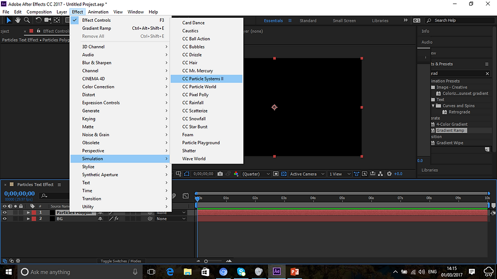
In addition to this, I messed around with effects and in accordance with the video tutorials instructions, I settled for CC Particle Systems II. This changed everything back to black again. I will eventually get the hang of this in time.

I played around a bit with the physics element, twirly was the one used on the tutorial. There must be a point to this as the effect doesn't look like much to me, but time will only tell as what it is going to do.

I also played around with particles and settled for the TriPolygon effect. This looks really fun and vibrant. This is what is going to be used for the video. I honestly don't know why.

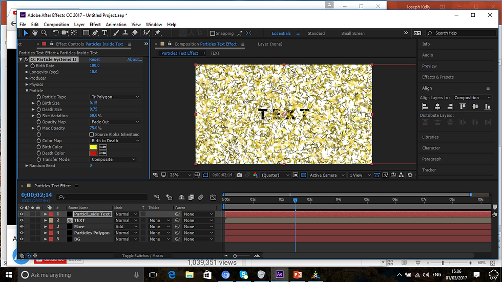
I am now experimenting in different colours, this pink color looks really nice. I might work with loads of other colors in due course, but I think I will persevere with my current choice at present.

There is also a flare experimentation as well, which I think looks like nothing much at present, must be what makes it lighter perhaps, we will see.

The red line I believe is where the elements are going to move around. So this is going to move around in a straight line I presume.

Yep, this is where the particles move around. This is a track where the flare slides along. So far I think it is looking good. But there is a bit to go yet.

I used the Pre-compose facility, this is what turns all the solids into one big solid. I am beginning to learn a lot about After Effects and what it entails.

The text is becoming more and more visible. Yep I added a text layer as text is the main focus of this video.
The TriPolygon is flying more around the text right now as we speak. Pretty cool stuff, but I don't see what this is doing right now, but it is coming along.

I changed some of the colors from pink to blue on the text layer. I don't think that this looks too bad, especially that it is starting to show, the particles are hidden behind the gradient layer and only showing through the text layer.

The particles are now moving across the video. This is really good to see.

And the text now shows as the triangles pass. I don't think that this was a bad job for my first attempt. This will be the first of a good few tutorials that I am going to do.
Here is the finished and final outcome of the video in question uploaded to YouTube:
The finished outcome was a great success. A bit tricky in parts, but I am learning a lot about this new program all the time. This was a video tutorial and I had no inspiration for this design. This was done to the exact standard as the YouTube video tutorial and I am hoping that these will prove helpful to me in my movie title sequence.
Also, to do a movie title sequence like this to me, sounds OK, but a bit tricky in parts, so I will go on and research further into other tutorials out there and see which ever one suits me.
CATCH ME IF YOU CAN SIMILARITY SEQUENCE
This afternoon I found a tutorial for about 3 minutes on YouTube as to how to create a title sequence that closely resembled the Catch Me If You Can sequence. This is it here:
It was a relatively easy enough tutorial to do, it only lasted about 3 mins as stated above, but in my time I took about an hour to do this to get the basics right and so on. In additional to this small evaluation, I added screenshots as well as the finished outcome to this blog with annotations accompanying these.

Starting a whole new composition. Set to 1920x1080PX.

Which has now been successfully set.

Changed composition screen to blue to adapt to the tutorial’s color.

Text added to the screen.
Scaled it down a bit to make it look like the actual poster. I do not know what he means there though.

Just about to click on Create Shapes from Text to make the shapes.

The letters are ready to be shaped now.

The keyframes are to be added, starting with h

And the n for now.

Pressing U on the keyboard eliminates unwanted properties for the moment on the keyboard, only leaving those that have changed so far.

I’ve suddenly began creating shapes out of the text so far. Am finding this a hard job to do, but every avenue should be explored

And the same has now been done with the n now.
They are to be easy eased to give them a nice enough look.

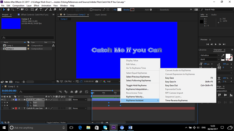
Now with the keyframes added, the keyframe assistant is selected, but for what purpose? To easy ease them to make them nice and smooth in appearance.
When I exported the video, the background color turned to black for some weird reason, for which I don't know for, I've still got a lot to learn about After Effects and it's elements. I'll carry on with these tutorials regardless.
In the meantime, my video is done and I was quite impressed with the layout of it.
I will not be shaping my text in anyway as I think that it looks quite weird for the style I have in mind for my title sequence, even though it is in the style of Saul Bass itself. Only for it's colors and type will I do this in the style I've experimented on just now.
Every movie has a production logo that introduces it right, well this is what I am thinking of doing for my movie title sequence. Something simple and not too complicated to do as this project is complicated enough for me as it is without having to add in a blooming complicated logo to add in as well.
So here is how I am going to go by this. I like the look of this video logo design here:
Mind you going the extra mile would be better, so I might try doing this one above here, I may say that it looks straight forward, but it is easier said than done, so let me see how I go with this.

In accordance with the video tutorial I created a composition of about 1920 X 817 PX. Which is an anamorphic resolution which has an aspect ratio of about 2:35.

A new solid is created for the light-burst effect perhaps. It is a bit early to state at this stage why I am doing this.
I never give up on anything, but this will have to be it UNFORTUNATELY, as I’ve discovered on the tutorial that I have to add optical flares to this tutorial for my logo sequence to work, but as you can see!!!

But on my computer below, everything might be greyed out, but Video Copylot is not there.

Optical Flares belongs in an effect called Video Copylot and I haven’t got it and it is costly to download, and also an unnecessary expense if I might never use this facility again after this assignment, so I am going to abandon this decision entirely and create this logo instead:
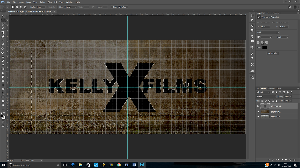
I downloaded a PSD located on the video description on YouTube to create this image for my movie title sequence.

There are 2 files in this PSD file, a stone wall and a bare metal wall. What their purposes at this point are for, I do not know, but all will possibly be revealed right.

Since that this is going to be a 3d file, I have to check my 3D preferences to see if my computer is going to be able to stand the strain, we shall wait and see.

But all looks to be OK for the mo. Might take a bit of rendering time though.

Text is then added in. The tutorial text is MediaXFilms, but I am naming this after me, so I am calling it KellyXFilms, just to add my own take into it. I think it makes perfect sense.

However since that a typographic logo is being created, I am increasing the X as stated above here to put this into motion.

I experimented as instructed with the tracking and the baseline shift as this was instructed of me in the video tutorial.
I’ve now experimented with using the rectangular marquee tool, I presume there is a point to this.
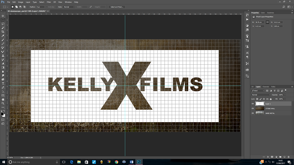
White was added to the document. What next?

Further experimentation of the marquee tool was added to the document around the text, and for what purpose?

By pressing delete on the keyboard deletes areas outside of the logo, this is how the logo is to be created.

Now I am experimenting with the 3D option as instructed.

And now in the 3D workspace. Things are going to get interesting I gather.

The logo is now a 3D layer. This was accomplished by clicking on 3d and extrusion mesh from selected layer and this is the result.

Which has now led to this by highlighting the 5 layers and the metal effect. Awesome!!!

By clicking the extrusion layer and changing the reflection, the logo has gone brighter.

Now rotated to 90 degrees. It is really coming along. So far I am finding it easy enough to do.

By merging them together, it now looks a bit weird. But there is a point to this I take it…

I am experimenting with the 3D lighting techniques now on Photoshop. It has taken the weirdness of the logo’s look away and I am left with something like this by using Infinite Light.

Near enough done now. Just playing with the rotation and positioning and experimenting with the shadow now.

Yes I am happy with this now. A few more tweaks remain though.

The rendering is now in progress. This is going to take some time to do.

A composite snapshot is taken in order to delete the background.

Mission accomplished.
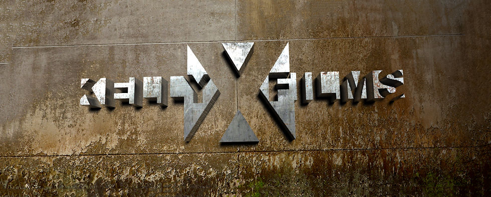
This was done by using the Polygonal lasso tool and using the edit and fill option. It looks really good I think. It works really well for my logo sequence for my opening title sequence.
In due course I will take this into After Effects and play around with this and make it look more visually interesting than it does now.
GREEN SCREEN FILMING
Here are a couple of the clips filmed by us in the college studio that I am going to be working on.
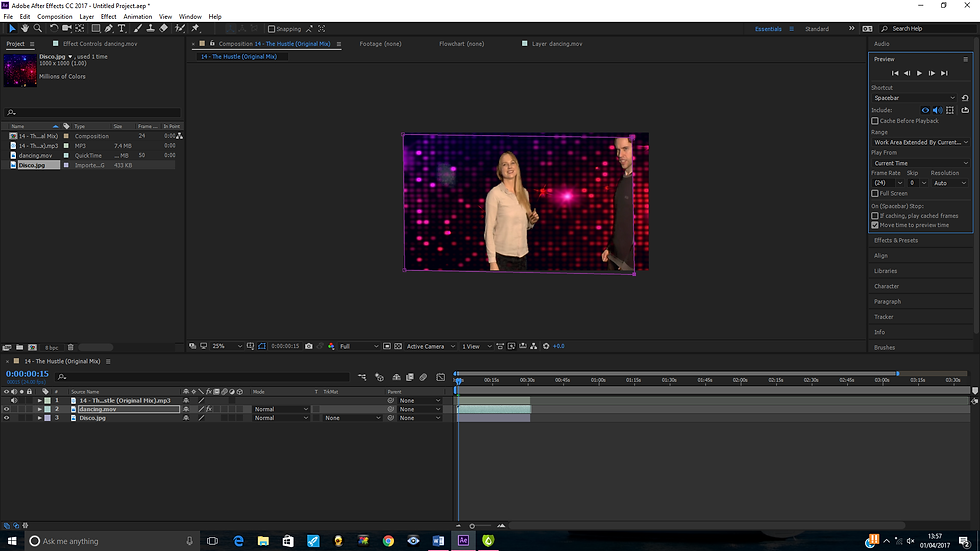
Another fun technique I've learnt during this process is Green Screen filming. Meaning that you appear in front of a camera with a green screen behind you as so you can edit out the green screen and put a background behind you, such as a disco wall. Let me show you one example here:

Here is me and a fellow student of mine, unfortunately the screen is NOT going to be entirely green due to the size of the studio and all the equipment surrounding this. Only time will defo tell if I am going to be able to pull this one off in my Green Screen editing.

I am going to completely remove the green screen background now using the Keylight function in the effects drop down list and to do this, I am going to select Keying to remove the green from the background.

Hooray!! it's done. The only downside though is that shiny white light that is now in the background and I have a tiny feeling that the subjects in the footage are going to be pixelated as I can see that I myself am now pixelated as shown in the black background around my jumper. I must look into deleting this in due course.

I used the eraser tool in the hope that it would delete the white light, but by doing this now, me and my partner for this project completely disappear altogether, this is no good I am afraid to say, so to make it look good, I am going to reverse this change entirely.

This looks to be set at a good enough resolution now for this film clip. Since areas are masked out, bits of us might disappear altogether.

It looks to be coming along nicely. Trying to be careful not to edit bits of either my partner or myself.
Yep, as you can see, I am going outside the masking path altogether. Unfortunately, due to nerves at the time of filming, I went pretty much all over the place from L to R, whilst had I stayed in the spot at the time, the result might have been a whole load better.

I am using my Adobe CC Media Encoder to make this video and export it as such. Watching a video tutorial on green screen filming has thought me to do this. Sadly I forgot to keep a record of this YouTube video's URL to show the video as evidence that I did this. I will root around for the video and if found, I will add this to the blog.
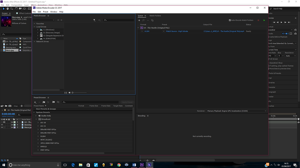
The video is now in the render queue for export. This could take some time considering the fact that I am using my laptop for this.

The video is now saving.

The video is complete. The conditions of us in the video are NOT very good as my friend is invisible (you can see the lights of the disco through her arms) I am going to have to learn a lot more of how I am going to do this I think if I am going to make my title sequence work.
Here is the video in it's finished glory:
Looking at the video, it looks awful, we are pixelated and virtually invisible. The video is only to last about 25 seconds or so, but it goes on for about 4 minutes. When the video turns to black, that is as good as it gets for the next 3 minutes or so. I am not totally disheartened by this as this was my first attempt here and as far as the assignment goes, I shall get better at this.
I am now going to do another green screen exercise for this blog featuring another of my friends who is going to be dancing around the planet Jupiter which I am going t create using this video tutorial enclosed below:
I think this would be quite a good thing to put into my blog as exercises to help me with my movie title sequence. Here is how it is going to happen:

I am going to create the moon using the texture enclosed in the video description. This is optional, but I always follow every instruction to the letter whenever I do any exercise via YouTube video tutorial.

I am creating a Photoshop document for this exercise to the same dimensions that has been made known to me in After Effects. The dimensions given to me on the tutorial were 1550W X 870H PX with a resolution of 150 PPI. But since that this is going to be in my clip, I will use the preset fit for HDTV.

The Photoshop document is created. I think I shall find it easy though to work without the guides in this particular case. I can revive them in due course if needed.

I am going to add a gradient to design the texture of the planet Jupiter. In order to do this, I must listen to the instructions on the video to get it correctly right, otherwise it is going to look weird for my liking.

I’ve changed the color model from RBG to HSB meaning Hue, Saturation and Brightness. This is done because it would prevent the over saturation of colors.

Dragging the Hues to the far right gives it a nice consistency of colors. This looks really good so far, maybe if I tweak the Sat and Brightness it might make the Jupiter texture more and more consistent.

Dragging the Sat slider decreases the overall saturation of the colors. This is looking more and more unconvincing that I will get the right result at this stage. Maybe the brightness might change things a bit.

I experimented with the randomize button to see gradients conform to above settings. This gave a good consistency to the planet Jupiter I think.

Converting the image to a smart object allows me to modify the filters at any given time.

Experimenting with the ripple setting, probably to give the planet some consistency I presume. I am just doing as I am told here as I am creating this via YouTube video tutorial. At least my colors make Jupiter look more and more realistic.

The ripple setting is added. It has slightly distorted a bit, but that is all part of the design process.

The transform tool is turned on, temporarily hiding the filters added to this as warned via pop up message.

I am going to warp the image perspectively here now to make Jupiter look more and more realistic. Only time will tell how this is going to work. Only I am learning loads of newer techniques all the time here that I’ve never used on Photoshop before.

I’ve dragged the left top part of the planet Jupiter upward. It looks very much like a real planet now so far. But it is only early moments yet.

Now I am on the Warp Mode icon which has transformed the perspective filter to the basic warp filter. Only time will tell how this is going to look once done.

Warping done, but to me it looks a bit odd for a planet, but Marty’s is pretty much the same as shown below this screenshot:


But I have a feeling that he is going to mask this up at the far right as he is going to cover it up with a deep shadow as shown below here:

To which I will be following along with pleasure.

To pull this off, I have to reset the gradients back to what they were and set the new layer to multiply.

My deep shadow is drawn, making it look a whole load better than the previous take. This makes the planet look more and more realistic now.

To make it’s shadow look more and more realistic, I added an arc to it by using the warp tool for this. This is as per instructed by the video tutorial. It is looking more and more realistic now.

A bit of playing around later, I experimented more with the gradient layer and made it look more and more realistic before as this now looks convincing for a planet of Jupiter.

Now it looks like a real planet in outer space as I also readjusted the shadow to make it look more like a real planet, which it now does.

The moon is now in progress. It looks nothing like a moon from where I am sitting. But time will only tell how it is going to pan out.

Maybe using the spherize filter may shed a bit of light as to how it is going to work at this stage.

The spherize option made the moon realistic and I had to duplicate the filters twice. This was a pain for me to do as Adobe have changed many of their shortcuts for the keyboards. I don’t know why this has happened, but it has. I then dragged the moon onto the Jupiter texture. This looks realistically as if that I’ve now created Outer Space on my own laptop.

I’ve changed the size of the moon to make it look more and more scopeful which it now does as the last moon looked enormous in size.

Dragging it up a little bit is making my space image look neat. It is unknown at this stage as to why I did this, but as stated that this is a video tutorial, so just doing as I am told.

The moon has been given a deep shadow as to show it is reflecting on the planet Jupiter as the moon normally does.

To make the shadow look denser, I played around a bit and made the shadow even darker. This makes it look more and more consistent.

I made my planet more lighter to the left by inverting my colors shown on the left and using the dodge tool. I think it is looking really good now, especially since I’ve made it brighter.

I’ve been asked to turn on the liquify tool now. As to it’s purpose is anyone’s guess, maybe it is to transform the planet perhaps.

It is to create a twirl effect in the planet Jupiter. Making it looking more and more realistic all the time as this is what Jupiter looks like.

My desired beautiful looking planet is done and my green screen exercise for the second video will be done proud.

I am now going to experiment once more with the Hue Sat colors now, lets see what consistency that this gives.

And this is the cool result. To say that I am proud is an understatement. This took longer than anticipated trying to write this evaluation and save the screenshots at the same time evidencing my work, but it has been worth every minute as it has been given such a good result.
One implementation of my own was to add stars to the black sky to give outer space some more consistency, which I think that it does.
Now here's where the planet Jupiter comes into this part of the design:

The young lady in the image above is getting ready to float around Outer Space. This is her with the Green Screen behind her.

I’ve taken away the Green Screen from behind her and increased the screen softness to about 50. Shame about the pixelated imagery around her edges. This exercise is far easier as the previous one involved a load of tweaking due to the movement around, virtually caused by me moving from one place to another constantly.

I’ve made her completely black around her now. Mind you, I kind of like the glow around her, as she is supposed to be a creature from Outer Space, so this fits quite nicely I think.

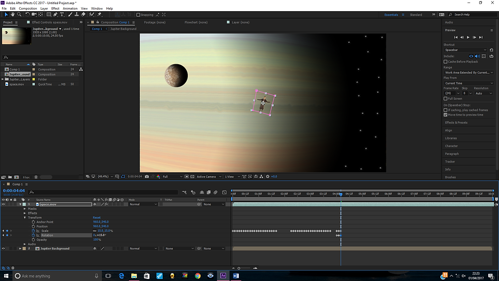
The female subject has been scaled down to zero percent here. I plan on making her grow 5% every 2 seconds.

The scaling is now up to 20% and she is growing all the time. It is looking really good and Miha is floating around the planet Jupiter.

She has grown now to about 50% and ever more looking wonderful. Time will tell if I can get the result I am hoping for, but this is doing me proud so far. My After Effects skills are really coming along.

The young woman is grown to about 80% in scale now and is really looking realistically like she is dancing on air in outer space.

She has reached the grand total of 100%. Looking really good so far. It is as if she is dancing on the planet floor itself.

She is going to shrink back down again now to the lowest number every -5 seconds now in this case to make the space video more interesting.

She has shrunk down to 45% now and slowly disappearing before me. Looking really good so far.

She has now shrunk to the point of disappearing entirely. Looking visually interesting so far and looking good.

Now my friend Miha has completely gone now. I will forward the clip to a further 25 seconds and make her appear with a vengeance as she will rotate in.
She is revolving in and growing at the same time at every 2 seconds and growing and turning 5% all the time as the clip progresses. So far, so good I think.

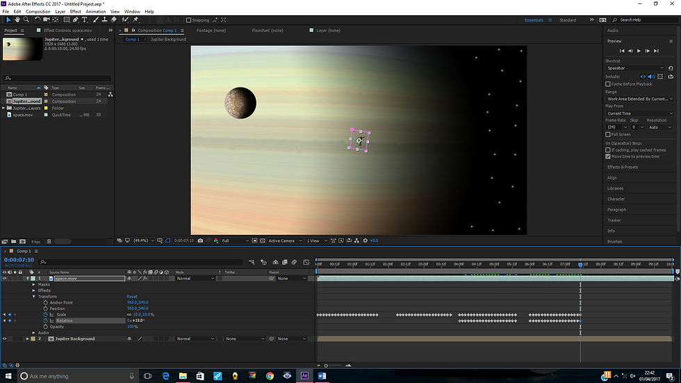
I’ve now got her grown to 70% and almost at a quarter past position. Looking really good so far, but looking slightly funny. Cannot wait to see the finished outcome once done.

I have now got her at 90% each way at a quarter to three position. So far looking lovely, but still cannot wait for the finished outcome.

Now again she is 100% each way. It looks as if she is walking on Jupiter. Looking good and looking lovely. Now she is going to shrink down again each way around 20 seconds from that clip.
Now shrunk down to 10% each way. It was as if she was walking on Jupiter and turning around and walking away again. Either way, looking good.

Again she is completely gone. Now as to what to do. This time I might make her come in faster, say every 20 seconds and growing every 20 seconds.

Which is what she does and is going to disappear like a shooting star into the wilderness. This file I did last night, which unfortunately for me I lost due to the fact that I’ve been warned that After Effects is a huge program which can use up a blooming great load of ram which broke on me, so I lost the work and to say I am gutted is a complete understatement.
So I took it upon myself to reconstruct the work again today. Everything remained the same as stated in the screenshots added into the blog, except for a few new tweaks to the video file, such as:

Like for starters, I grew her back with the intention of getting her to walk the full circle, this is the woman at 50% scaling, she is really coming along nicely in the clip.

This is her scaled to 100% and is ready to walk the full circle now.

The young lady at 25 degrees, looking very effective indeed.

Now she is upside down, but looking good.

Now at 75% she has 3 quarters of the circle walked. Coming along lovely so far.

She has walked the full circle so far. Now she is about to disappear completely.

The woman has completely gone now. I will forward the clip to a further 25 seconds and make her appear with a vengeance as she will rotate in.

I’ve transferred the video file to Premier Pro to add the sound effect. Sound effect from this source: http://www.freesfx.co.uk/sfx/Eerie?p=3 track 7. For the purposes of the Harvard referencing, I will be downloading all my sound effects from this site, so will only reference this once.
The video is exactly 10 seconds whilst the sound effect is a minute long, so I’ve duplicated the video file so that I could keep the sound effect going for the full distance and what not and it looks really good. Miha is dancing in space continuously.
Here is the finished outcome:
Watching it looks really good and very well done. Except for one tiny little blip:

The end of her finger looks set to disappear as it disappears out of the mask set by me.
I will be using Green Screen Filming, but I won't be using this sequence for my movie title as this was only an experimentation to learn the basics.
The one thing I need to learn a bit about Premier Pro is to fade out the video as the ending is pretty blunt at this stage, Premier Pro is not a product I use often enough, the last time I used this was in my level 2 media studies course 2 years ago and I’ve forgotten the basics of how it works.
I would like to create a movie title sequence using this amazing YouTube video tutorial below here:
My idea is an Around the World in 80 days sequence, except I am going to name my film Around the World in 3 Minutes.
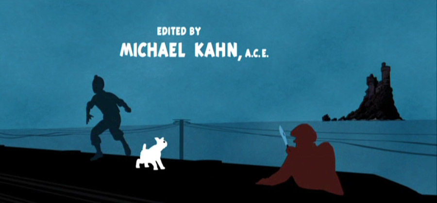
I am inspired by the Catch Me If You Can opening title sequence using Saul Bass techniques as shown in the image below here:

Except my idea is going to be more fixated on my mascots driving cars throughout various different parts of the world in 3 minutes, such as London, Paris, Egypt and so on. More on those later.
The thing that inspires me about this movie title sequence is more and more based on the movement and the colors rather than the composition. It is a kind of a rip off from Saul Bass and I enclose it below here:
Other inspirational ideas which vaguely resembles Bass style is this opening title sequence below here of Tintin. My title is to be a replicate of this.
And this image of Monsters INC is another good idea of mine as it is colorful and vibrant in contrast.

Another good idea is to transform elements in the footage into silhouettes as depicted in the video below here, this is another good idea for my film if I wanted to do this:
this was created using cutouts and fabrics using stop motion techniques.
So far the researched above is just an idea at present. This could change accordingly as the assignment goes onward. But hopefully this will not be the case as I really like the ideas of what I have researched so far.
Here is another interesting video I viewed with stop motion using PlayDoh:
This is an interesting video I think and I would find it interesting to add this into my film title sequence. Only time will tell whether I will be able to pull this off or not, but I am sure as hell am going to try.
I've reflected this idea within the last few days and I've decided to scrap this idea now and make it into a Around The World in 80 Days type, except that this guy is going to be running a lot in the sequence. This will be me by the way, using green screen filming and I will give myself a silhouette effect. This film will consist of stop motion filming as shown in the video above here with the Plasticine and by using tissue paper effects and silhouette skylines. This to be arranged with Jim the technician at college tomorrow (Mar 14th)
Except my film title is now called Around The World in 2 Minutes: The Splattered Fugitive, everytime he runs past an iconic scene worldwide, the scenes will splat and this is where the playdoh comes into it. Here is an example of a movie made with the splattered effect using Plasticine:
This is one idea of what my film title is going to consist of. As mentioned the scenes of the person running past the locations (i.e. me), the scenes than splatter and this is where the names pop up. I think that this is a good enough idea and a fun one too. The film genre is something of a crime spy spoof movie and movie title sequences that inspire this idea range from the following sequences:
It is a mystery type movie, so I think that this can be inspired by The Pink Panther perhaps:
Inspired by the mysterious locations and design as well as colours and music, But this is only the first inspiration. Big hands go to the De Pate Freleng Enterprises for this main title, created rather well.
From around 2:40 into the clip, there is a brief Italian score as The Pink Panther is rowing the gondola, this is also inspiring me to add music clips of the locations where the man is going to be running past. Feedback indicated to me that movie title sequences only need one song, but watching this video has inspired me to do just that, but as I said, only time will tell if I can pull this off or not.
In addition to all stuff stated about this movie, it is also a funny sequence and I think that this is something that was inspired by Saul Bass himself in terms of designs, movement and composition. It is about 3 and a half minutes long and a great source of inspiration for me to have mine at this length if required.
Another sequence I viewed as inspired by terms of the colors now and comical aspects is a sequence designed by Bass himself is "It's a Mad, Mad, Mad, Mad, Mad World" as well for it's humour, but there is no splat effects in this sequence as well as Pink Panther. This is just my own incorporation into these styles. Here is the Mad World sequence:
And YES, it was created by Bass himself as stated in 3:15 into the video. The sequence is inspiring me for movement, humour and color combinations. On another note, this sequence runs for about almost 5 mins long, so inspiring me further to strengthen this out a bit longer if I should be desired to. But not forgetting that it is a kind of an action packed sequence as it is about a man on the run worldwide, so it would be a kind of a James Bond sequence and one springs to mind here:
The inspiring thing here is the action packed spy movie feel to it, and it's colours on the typography and their positioning. Another thing springs to mind is the spoof elemency it brings to the sequence, the uses of shapes and their movements and positioning. The typography fits the sequence well here as well I think and I can reflect this in my sequence during the production process.
Since I am going to be doing a Saul Bass style movie title sequence, I've hunted down a good few YouTube video tutorials for After Effects Saul Bass style and I've found this really good one below here:
I've completed this tutorial now and even though the video was about 13 minutes long, it took me about the best blooming part of about 2 hours to do as I've found this pretty hard as the speaker of the video babbled on pretty quick and I found hard to follow along as I am used to a slow leisurely pace in my work. Anyway here is the video of the tutorial I completed:
I think it looks a bit shoddy for my particular liking. This idea I am rejecting as it took me the best part of about 2 hours to do a basic sequence video using shapes. I will carry on using tutorials and experiment more as well in doing this title sequence.
The new name for my movie is now called The Splattered Fugitive. This is because I think that it is far more significant than The Splattered Fugitive Worldwide.
Here is one example of a similarity of how my movie title sequence is going to look:
I think by looking at this video I made, I think that I did a good enough job. The tissue paper for the sky effect looks a touch or 2 weird for a Saul Bass style sequence. So I am going to use flat colors for my sequence, just like Saul did and use Playdoh for the splattered sequence as stated on my synopsis.
The fugitive would be running from the law all over the world and would visit places such as London, Rome, Barcelona and so on. Here is my synopsis, I will present my more professionally designed synopsis with all the paperwork I plan on submitting on the side:
OVERVIEW: The Splattered Fugitive is about a man who loves playing with Plasticine and is on the run from the police. This movie is inspired by the story Around the World in 80 Days, but it will have a more weirder transition to it, this movie title sequence is going to be about 2 to 3 minutes long and he is going to be running around the world in 3 minutes so to speak. The film’s genre will have a comical feel with a hint of action to it and it would probably even count as a family film given the props used in it i.e. magnets and play doh respectively.
HOW TO GO ABOUT IT?: I will act as the fugitive in the title sequence. I will pull this off by using the ‘green screen’ filming technique which will allow me to remove the background easily enough in After Effects. Then as stated, I will be creating the location sequences using Silhouettes and tissue paper textures found from Google. If I have time enough, I might go all out and design these textures myself using Illustrator and Photoshop respectively, if time allows me to that is. There will then be a splattered sequence designed using Stop Motion and alphabet fridge magnets that will depict the cast and crew of the sequence in general.
PROPS NEEDED: Play Doh Alphabet Fridge Magnets Computer/Laptop Adobe Creative Cloud
LOCATIONS FUGITIVE RUNS PAST London Paris Rome Barcelona Egypt Tel Aviv Saudi Arabia Doha Taj Mahal Pacific Islands Ayers Rock Sydney Auckland Christ the Redeemer Brazilian Carnival Mexico Hollywood New York Iceland Dublin Glasgow Edinburgh
The title sequence will be mainly inspired by Saul Bass, but it will have a new element added to it, such as the Play Doh and the the alphabetic fridge magnets. I will put this into practice with the stop motion techniques I've learnt over the past few weeks. I will present these into video form over the next week or two.
Here is a movie title sequence I find effective and the same kind of style is designed in this that I plan to use for my movie title sequence. It is called On Her Majesty's Secret Service. The video is here.
The title for On Her Majesty's Secret Service was effective for it's color technique, movement, typography and music. My title will be something very similar to this in terms of color, type and music. there will be only one person running in this which will be me. Big hands to Maurice Binder for creating this sequence and here is another more modern version of his title sequences which I find effective, it is called A View to a Kill and here is it's link below:
Very effective and modernised version of the James Bond series created by the same guy that designed On Her Majesty's Secret Service title sequence. Except that the View to a Kill sequence would require more actors and a whole load of green screen filming, but I am a graphic designer right, not a media student, so will use only graphic elements and very little filming and stopmotion for my sequence. A View to a Kill went in there to compare the two by me.
This other visually interesting movie title sequence of the gangster movie Goodfellas, where you have the text come speeding in from the right and left as if it is a car speeding by, very cool stuff and probably easy enough to do in After Effects, I might try giving this a go at some point, but I will probably reject this idea as it looks too simple a task for me to do when I am capable of much better.
Righty o, in the production process, one of the deliverables required is a newly heard of heard to me Gantt Chart. I looked these up and they range from a good few and some of them look interesting, whereas others do not. The five I wanted to include on my blog I wanted in particular to talk about are as follows.


Most of the 5 Gannt Charts above found from several web sources look as if they have been designed in Microsoft Excel. Alright I am a dab hand in Excel, but I am doing Graphic Design, so I would like to create my Gannt Chart by using the skills learnt in the course that I've learnt over the past couple of years, so let me talk you through the progress.
The above screen shot is the background of the Gannt Chart. It is supposed to be a Gannt Chart right, so I am not going to make it look as if it is a piece of artwork, just to make it a lot more interesting.

Now the typography is coming in, yep you guessed it: Gannt Chart, the introduction to the chart.

The list of tasks to be undertaken in this assignment are now in the chart in question. Looking good so far, but it is only just a chart and I think that this looks appropriate in this case.

The bars indicating as to how long a job should take to do. The blue colour is going to be a task in progress such as the research task as to be able to add new ideas to the project in progress according to the assignment goes along. The green colour is a job in progress outside of research and planning and the deadlines for this will be met.

The research and planning are one task as a whole, so I deemed it appropriate to change the task written as such. Although the white bands need to be the same width as each other to make it look more better though I think.

Which I did, even though I left out the final evaluation band as it is shorter in width than all the rest, I shall fix this up now to make it neater and tidy and then it will look perfect.

Which I think it does for now. Somehow my gut feeling is telling me that this doesn't look right though.

So I went off and made a few tweaks to it by adding a line at the end of the chart indicating the deadline and most of the bars hit this line to indicate that the work will be completed by this time. The planning and research as well as the evaluation of the work in progress will be ongoing. I think that this is a good idea though, just incase that ideas change along the way and the evaluation in progress is good for me as it means no headaches towards the end of the work.
Here is the finished outcome:

Something tells me that I am not going to stick to this Gantt Chart whatsoever, as ideas are going to change along the way. I will carry on adding in research for the next few weeks or so as well as evaluating the success so far.
Began storyboarding for my movie title sequence. It doesn't look perfect, but I don't care as this is a way of me recording ideas in my head onto paper and that is not such a bad idea. My storyboarding is not finished yet, but I am going to put one of the ideas onto digital software right now.
This is page one of my storyboard so far:

As you can see it isn't a perfect storyboard, but then again what storyboard is. My man on the run here is just a big black blob but, this is just a way for me to record my ideas for my movie title sequence onto paper, it is not meant to be a Monet standard of work, but just a quick smart way for me to broadcast ideas in my head onto paper for show. I am going to add a film logo made by me, that is not in progress as of yet.
In addition to my storyboard, I am now writing a synopsis (proposal), which are a few of my weaker points, but I must get used to this I guess because I possibly might have to write further synopsis' for real in the real world from June onwards, so now is a good enough time to learn. To help me, I will use this slide found from Google for guidance:

I wrote my synopsis in the best way I could, stating the movie's overview and how I am going to go about making the movie, using stopmotion techniques and green screen filming and so on. I don't know if it sounds vague or not, but there are others that I've seen on Google images that look similar to mine and these were found at:
https://www.google.co.uk/search?q=Synopsis&source=lnms&tbm=isch&sa=X&ved=0ahUKEwjTqtOHh-vSAhVDFMAKHVkJBbgQ_AUIBigB&biw=1366&bih=667#tbm=isch&q=synopsis+film&*&imgrc=E-7ooyyE0R0H1M:
I also found this synopsis example a good source of guidance:

Obviously the plot is different to mine, but it gave me an idea as to how a sypnosis works and I found this a good source of guidance for my synopsis report.
Now I have done my design brief below here:

I've began the production process for both the London and Paris skylines, the skylines will be the same when I do the running sequence when I put this into production with Jim in the studio next week.

This is the London skyline sequence, it is a silhouette which I need to doctor a little bit with Adobe Photoshop, but it looks in good enough quality for me to separate it from the sky.

This is the image used for my first London skyline idea, like I said, it looks easy enough for me to manipulate using Image Manipulation Software and I tried this with Photoshop today.
I took the white sky out of the image and for the purposes of this evaluation, I turned it red just to experiment, it is very watermarked and I am unsure if I can get this to a standard that I can expect it to.

I am adding black paint to the silhouette as shown above here, do you notice the difference so far? Looks good I think, but time will only tell if I can get it right, but we shall see.

It is the London Eye that I am having the most complications with as these lines are pretty much diagonal and very faint and most of them look pixelated, but that is Photoshop for you, I must find a way of resolving this.
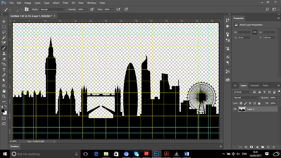
Now that I have painted in the lines, it looks OK, but time will only tell if few white gaps could remain, but this might not be possible at this stage especially where the lines all form a circle on the London Eye on the far right. When I add the sky texture onto the image, I will know there and then.

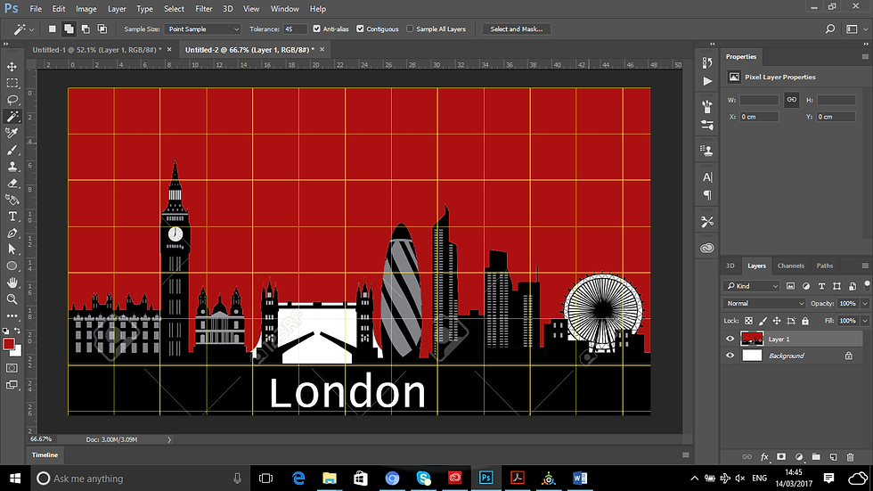
Right the sky texture is in the document now. Looks alright, but it is the London Eye that is making it look a bit weak:

Few white gaps can remain especially where all the lines meet up in the circle, so I might have to scrap this idea and replace the skyline with a PNG silhouette version of the London skyline.
Tuesday 21st March 2017-PRODUCTION IN PROGRESS
So far I am working on my locations on Photoshop using silhouettes and tissue paper textures. It is an easy enough process to do, just needing to separate a lot of the images from their backgrounds, sometimes it is easier said than done, I just need to watch out for a few pixels that remain.
Easter Sunday 2017 MY IDEA AT LAST
Am sitting in my bed and have come up with a really good idea now that looks more Saul Bassey in my opinion. I am rejecting the idea now of using Play Doh and fridge magnets as I feel that this isn't really the style that Bass used for his style of work, he was more on animation and flat colors, so that is what I will do.
Here is one example of how it is going to look:

This is just experimentation at the moment using the silhouettes and type. This is Photoshop I am using here.
One example I tried doing in which I learnt last year during my Personal Style class is to experiment using an animated GIF below here:
I do not like this idea though very much unfortunately, this is very vague, a second long and just a very short experimentation to put my GIF creations into practice. I will experiment further down the line with this.
I began my running sequence by getting a friend to film me running as this is what I shall be doing in the movie title sequence. This is the outcome of that particular day:
I am only using the running sequence from when I come in from the right from around 0:03 to 0:10 seconds as this looks nicely done and when I come in from the left, it will be from 0:44 to 0:47 seconds for the same reason.
The production of the movie title sequence has officially begun. I am experimenting with different effects at present, such as the Alpha Glow for instance. The only downside that there is a shadowy effect behind me as the filming was in progress resulted in me standing too close to the green screen.
I quite like the idea of the shadowy effect running alongside of me as this could give the idea of the fact that the man has somebody running alongside him and maybe even follow him. I do like this idea.
I like this idea as this film brings elements of both Bass and Hitchcock all rolled into one, Bass for the design and Hitchcock for the suspenseful nature.

I began putting this sequence into practice yesterday using Premiere Pro software. Unfortunately as I am looking at it in more depth, this as you can see the result above, the London silhouette sequence looks more like a wall as the shadow is visible behind me as I run, so my tutor helped me resolve this by taking it into After Effects to fix it there.

Now in After Effects, the shadowy effect of me is now gone with the help of the Screen Gain increase and I blackened myself out completely so that I would be a silhouette whilst running to make it more mysterious in my opinion.

Which is what I did here and I find it desiring to my taste and more Saul Bassey kind of a title sequence.

This is the first part of my movie title sequence as stated on my storyboard, ready to be exported via Adobe Media Encoder.

Ready to be exported via Media Encoder CC 2017. This is how I do most exporting of my Adobe Videos.

The process begins as the clip is made. I am going to do all my takes this way and put them together in Adobe Premiere Pro to develop the final outcome.
Which is below here:
This is only just the beginning of the movie title sequence though. I am going to do all the sequences in After Effects and put time into Premiere Pro to export the final outcome. From around the first 5 seconds you see most of the action and the remaining 5 seconds, it is completely black. I am not discouraged by this completely as I can fix this in Premiere Pro by cutting it out.
Note: I am not going to screenshot the entire work in progress, as this will consume far too much of my time that way. I will just write about it according to whenever I put up the video posts onto this blog.
The Paris sequence that I created/exported using After Effects, I made a bit of a mess of as you can see below here:
The action is about a minute long and the video runs for 9 further seconds and the rest of the video is pitch black. I've decided to fix up this error by altering the timeline and I think that it looks OK now.
But it's not perfect enough for me to put onto my movie title sequence. So I will make more attempt to make it look right.
So here's what I did:

Looking at the screenshot above, there is small leeway inbetween me running in from the left to more leeway to the right.

The typography does not appear as I am running now in this sequence as opposed to the London sequence. This is fine as I want to give different elements to the sequence in question to give it better scope.

The typography appears after me running as you can see in the timeline above. This is fine as like I said, I want every sequence to look different to the last.

Actually the typography appears before I've completed my run around Paris. This might be better. I think that it is judging by the video below:
I thought that this looked a little bit better, but I need to run faster which I am going to fix now via After Effects.

Now in Premiere Pro and about to put the production of the final outcome together by exporting all the sequences via After Effects and putting them together in Adobe Premiere Pro for the final outcome design.

This is the first sequence that has gone in so far. I’ve reduced it a little bit editing out the black screen that appears after this sequence. I cannot wait to see the entire sequence in it’s entirety.

The Paris sequence went in, this is when I discovered an odd error, I am running a lot slower in this sequence as opposed to the speed I was running in the London sequence.
So I am going to export yet another video of the Paris sequence with me running faster.

Which I am doing now by changing the stretch factor to about 30 rather than 100 as this speeds the runner up (i.e. me).

Looking better, except the London clip was longer than the Paris clip, until I reduced it to look the same as the other clip. The Paris runner now runs a whole lot faster and the same speed as the London runner does. Looking good.
Screenshots of Premiere Pro will be put in here accordingly whilst the production is in progress.
The feedback given to me today by my tutor was that the sequences were effective and very nicely done, except that I must keep the same horizon point as the London sequence for all the cityscapes.


The Paris scape looks a whole lot different to the London scape in terms of scaling, which makes the production look weird so I will take this into Photoshop and add a guide line to match the London line and just draw a black rectangle and it should look perfect.
Secondly the text on the next sequence might be a bit too quick, so I must take a bit of time to review this a bit and rectify this mishap to make it more readable.
I took the feedback given to me yesterday very much to heart and decided to fix up the Paris sequence to make it match more like the London sequence.
What began with it looking like this:

Now looks like this. So it looks so much better now.

In After Effects, I changed the Paris sequence to fit in with the same time frames as the London sequence. Except I am going to do lots of different things with the text, just like Bass did with his title sequences.
This is how that they work out at:
PSD Files: beginning to 0:00:05:08
Running and type files begin from: 0:00:03:05
Running file ends: 0:00:04:06
Type ends:0:00:05:02
I've put in the new YouTube video of the Paris sequence below here:
I will now take this back into Premiere Pro to see if this looks right now.

This is how it started originally.
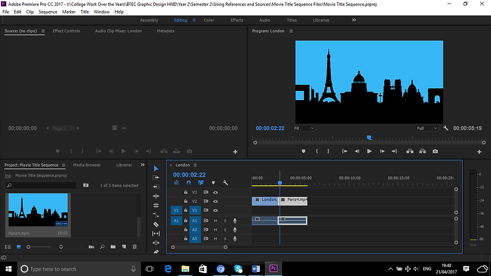
I altered the Paris sequence and it looks much better now. The city scapes are the same as each other.
So far I am sticking to my storyboard sequence order.


This is a moodboard of all my deas for my movie title sequence.

This was the first idea that entered my mind for my movie title sequence. Since I've now rejected the idea of using PlayDoh in my movie title sequence, here is the moodboard with the new idea for my movie title sequence using Saul Bass styling.

Saul Bass is inspiring my movie sequence for his color, composition and type. I felt it an injustice to Bass to even consider using Playdoh in my sequence.
I am up to the Barcelona sequence now. It is coming along pretty nicely. My original plan was to add stopmotion into this, which I rejected as I wanted to make it look more Saul Bassey which I might have stated in this blog somewhere.
Meanwhile I've exported the Barcelona and Rome sequences into video files this evening as shown below:
Barcelona comes after Rome by the way.
Both of which look effective. I might add another actor's name to the Barcelona sequence.
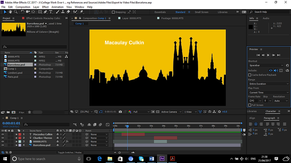
As you can see, I've added Macaulay Culkin's name to the list alongside Charlize Theron. This gives it some interesting scope I think.
Here is the finished outcome exported to video:
By watching this now, it makes my sequence look more interesting.
I actually think that the Barcelona one looks better than all the rest, I might fix up the others now to make them look like the Barcelona sequence. This is because the skyline lasts longer on this sequence as opposed to all the other ones do.

My movie title sequence is really coming along nicely now as the sequences carry on coming together in Premiere Pro. I will fix these clips up to make them look even more interesting as some are relatively shorter than others.
Today I am going to do this After Effects tutorial I discovered in YouTube to further my After Effects knowledge.
I downloaded this logo of Volkswagen to accomplish this below:


I am beginning by adding a new composition, naming it Particle Logo. Everything else is fine I think as it is.

A small setback is that the logo background was premade already by the person doing this tutorial. Meaning that I am going to have to create a gradient background to accompany this logo tutorial.

Which I plan to accomplish by designing this in Illustrator, setting the document to the same setting as the After Effects setting of 1920X1080 PX.

The gradient is just about done. If it is set to a radial type, it is difficult to get a desired result. I am trying to bring the light that is shining to the middle and let in some black on the sides, but not too much.

This looks about fine now. I shall save this now and carry on with the tutorial in hand.

I am trying to import the gradient file into After Effects, but for some very strange reason, it is not letting me do this. It is a JPEG image, so it should work. I will try and export this as a PNG image and see how we do.

I exported this as a PNG file and it works fine as it went in with no hesitation.

The two files are now in the composition.

I am pre-composing the background to make it permanent and it will become un-editable in this case.
I think that I got this wrong as it is the logo itself that was to be precomposed and not the gradient background.

It is the logo that is selected at this point, not the gradient background. I must rectify this as of now.

I extended the height of the logo a small bit to make it stand out a little bit more, this I think now looks a bit effective.

I think that I am pretty much getting it right as of now.

Judging by the way the video looks anyway, the top layer is selected, this makes the object in that layer visible.

I called the composition name logo comp.

And it is now created.

I have to create yet another precompose to the document in question, I do not know as to why this is, but I am sure I will discover this in due course.

I am now experimenting with switching the layers in the composition above the logo.

I am now creating a rectangle beside this as instructed by the tutorial. Possibly to create a mask.

I am a bit confused as it is obvious that he is creating a mask in this video here, whereas I am simply creating a shape layer. I might be right, so I will persevere further on with this.

I am aligning the rectangle beside the artboard as instructed by the video above:
I got the wrong end of the stick about this entirely. I should have done it this way:

I should have gone to Layer, Mask and then clicked onto New Mask.

And the mask is created.

I am forgetting to add the keyframe on the mask path section in order for the masking of the object to work.

As I am moving the mask across, the logo is not visible:

But by adding a keyframe at the mask path, the logo is starting to become visible now.

At 0:00:02:00 a key is automatically added in.

I am changing around the mask feather to around 40 pixels now. This makes the movement faded in slightly at the sides. Looks visually significant.

I turned on the particle logo now and it is now visible in the gradient background. It is coming along.

I am going to experiment with the effects and presets now, this is all part of the artwork in progress.

I tried downsizing this in Photoshop, but unfortunately it keeps to it’s normal dimensions as shown below here:

So I downloaded this one instead:


It fits a whole lot nicely here now that it matches the same dimensions as the file itself.

The artboard matches the same dimension now as the logo file is exactly the same as the animation file in After Effects.

It now looks a whole lot nicer now and flows consistently as opposed to the previous.
This is just too hard for me to do and I am wasting a lot of time on this trying to get it right, so I shall revisit this idea at another time I think and move on to something else on After Effects.
I might give this one a try below here:
Creating yet another new composition for my new exercise. Let’s hope this is easier than the last.

The Olympic rings are in. I created the logo of the Olympics myself when I was doing my Communication With Images project. The video used to do this is below here:

I’ve turned on the 3D layer on as shown with the arrows here above.

Adding a new solid, for it’s purpose at this time remains unknown.

I have now discovered that to proceed with the trapcode particular technique, I will either have to download a free trial for about a month or so, or enjoy it so much, it is going to cost me $999.00 to purchase, which is rather costly for a project for college and I might not even use it again thereafter, so I am now scrapping this tutorial now as well for this reason. Here is the proof of what I am talking about:

This is shown in YouTube that this tutorial uses Trapcode Particular,

In my After Effects package, I don’t have this facility and I have no intention of paying nearly a thousand dollars for software I might only use once in my whole life, so I will reject this idea as well.

For the full software, it will be a thousand dollars, it is much cheaper to upgrade, but this is hardly worth the while for me as I am sure there are loads of other stuff I could do and really get my money’s worth, so I shall give this one a miss.
I did a bit pf Photoshop animation last week and I came across this tutorial that sounds really good to do, so I might try this one out:
This looks really good animation for me to do and here is how I am going to do it:

A new document is created for me to do this animation.

To put this into practice, I must download a font called False 3D.
Font download link: http://www.dafont.com/false-3d.font

The font is now installed, it is all systems go for this animation exercise.

I wrote in Hello Everybody into this document.

Whereas Marty wrote in Congratulations Matthew!

I am now adding color to the text in question.
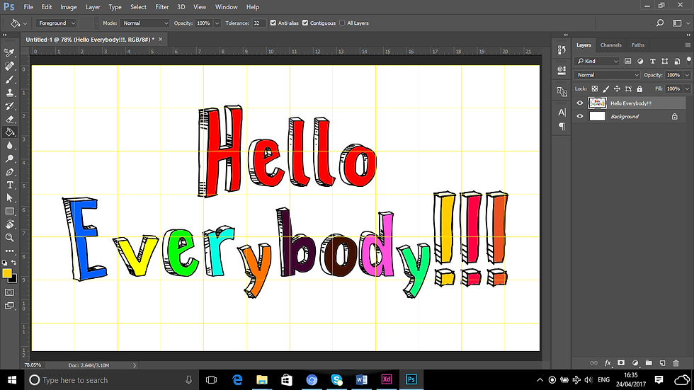
Color added to the text, looking good so far.

I am using the lasso tool to copy and paste the text into their own layers.

The original layer is hidden and the letters are now copied and pasted into own layers.

I dragged the text closer together by using the move tool and ticking Auto Select.

All the letters are piled up together and all frames for the animation created.

I am about to load the files into a stack now in order to make the animation.

Which is now complete.

Animation is just about ready to roll.

By making the layers into frames, this should become possible for me to do.

To give scope to the animation, the frames are set to 0.1 seconds in order to make this happen.

For the animation to be ongoing, I’ve selected forever.

Setting the file as a GIF animates the file.
The GIF is now complete.

This took hardly any trouble at all to complete as Marty the guy on the tutorial pretty much accurately describes every single step on his tutorials. I will not be using this for any title sequence as this was just an experimentation.
I am starting a new blog for this unit as this blog is now slowrunning and sometimes gets non-responsive. That blog will eventually contain all the Harvard Referencing.
Please click here to visit the new blog for this unit.
Comments