Evaluation for Movie Posters (Ideas Generation and Referencing and Sources)
- Feb 24, 2017
- 14 min read
In September 2015 I started doing a HND Graphic Design course, which has been very worthwhile and so far I've learnt a whole lot.
One of the units done during this period was called Ideas Generation. It is a unit of truly epic proportions as a way of putting all ideas together and this was in the form of designing movie posters, two in fact.
First of all was researching into different styles by other designers, I've found a good few that were awe inspiring in terms of colours, type and hierarchy.

For instance, Coca Cola designed this festive looking advert to promote Coca Cola. This is a festive advert hence the use of colours to represent Christmas and this advertisement is beneficial to a wide audience around Britain and Worldwide as Coke is loved by most people around the globe. Coca Cola is important for Christmas as people enjoy Christmas and like to drink Coca Cola with the intention of enjoying it and to have it as a mixer to accompany drinks like Vodka, Brandy etc. This publication is designed to be a billboard in order to let people know out there that “the holidays are coming” and it makes people look forward to Christmas ever more whilst they are either working, studying and shopping in the run up to Christmas. This poster has a happy feeling about it as it represents a Happy Occasion and all the lighting stars in it brings this poster to life in every way.
The graphic design techniques used for this looks as it cut outs have been used on programs such as Photoshop as this doesn’t look to have been hand drawn as the elements in this billboard have always been used for past festive Coca Cola billboards. The background of this billboard has a bold sense of colour on it and it is a drawn rectangle used with either Photoshop or Illustrator.

Another fine designer I've learnt about throughout my stint in college is a designer called Serafine Frey. Serafine Frey is a Swiss illustrator who’s work is well known for her earthy colours as shown in the picture above this text. This illustrates the subject of cops and robbers, this sort of publication would capture the minds of the more action lovers (i.e. action movie fanatics) given the subject of the publication and the dramatic use of colour that Serafine has used here. This publication would also be more suited to those who are in their late teens to the early twenties given the dynamic of the subject and would be more likely hung in a university or a college and a student accommodation as a picture like this would be unlikely hung in the family home.Serafine does most of her work hand drawn and then colours in using bold colours such as paints, markers etc. She also uses animation for some pieces of the work she creates. She illustrates a lot of she creates and takes great attention to details such as facial expressions, positions, movements and so on.

This poster of The Beatles Yellow Submarine inspired me for the uses of flat colours and flat design that this poster was created. I like the way that this was created, possibly inspired by Warhol himself as it looks pop arty and painted using paints as Photoshop and Illustrator were unheard of in 1968, when this movie was released. The Beatles Yellow Submarine, re released in 1999, had this design done to it and it was possible that software of some kind was used to put this poster together.

Piet Mondrian was an artist who was born in Holland in 1872. He went on to become of the founders of the Dutch modern movement known as De Stijl. Mondrian became widely recognised for the purity of his abstractations and methodical practice by which he arrived at them.
Mondrian created Trafalgar Square in 1938 when he moved from Paris to London to escape the threat of German invasions. His use of primary colours is amazing and these vibrate nicely within their black perimeters. Mondrian used Oil paints on Canvas to create this masterpiece
I like the uses of flat colours that Mondrian used for this masterpiece and they work well.
Research was over at this point and this was when I found this assignment a bit tough when it came to drawings and sketches of elements as drawing of any kind using pencil is my biggest weakness as my major field is digital, in fact, I used a pencil and rubber for the first time since I was probably about 12 years old. In time, I tried not to let this get to me as I just do rough sketches to record ideas onto paper, this works good for me.
Creating of moodboards was an easy enough going process for me as I was virtually downloading images off the internet and putting them onto Photoshop to create this moodboard. Sometimes, the imagery downloaded here was vague to the subject in hand and should be descriptive to the brief.

I based a lot of my inspiration on Saul Bass' designs for his posters. His uses of color and composition really impressed me.

To me, Bass' designs were minimal, not too much going on at all and in-spite of all this, remain famous and well known in the world as much today as they were when they were created for the release of these particular movies in the 60's, 70's and 80's respectively.


I like the uses of 2 colours as shown in the above 2 posters. This showed me that I didn't have to incorporate too much detail into my designs.

The font in this inspired my choice of font for my Scream 2 poster, as shown here in the screenshot.

I designed the Scream 2 poster here in the same design as the Dirty Harry one above. The process for this I found pretty much OK for my first real Photoshop poster making attempt. It was a successful process as this pretty much fitted the brief for a Bass poster style. This was created using Adobe Photoshop, The poster which looked amazing, was done in Photoshop, I discovered that after feedback was given to me that the poster looked pixelated in parts, such as in this screenshot here:

And a few white gaps remain, such as in the bottom of the mouth of the Ghostface mask .

Yep, pixelated imagery at it's best here. Not cool.
The Bend It Like Beckham poster however, was challenging at it's best here, as I used the inspiration for my colours and composition from The Beatles poster above, I find now that the typography for this poster was a little on the rough side as depicted in the screenshot below:

The font believe it or not, was used for a lot of the Alfred Hitchcock movies that were mainly horror or suspense, whereas Bend It Like Beckham was all about sport and romance as well as comical. If I had a chance to repeat this unit, I would look around for a more fun filled type for the shoe here, more on this later.
The colours here, the red and the yellow, depict Manchester United, as this is their logo colours as shown below.

this was a team Jess Bhamra, the main character of the movie supported as at the time of the film's debut, her idol was David Beckham and he used to play for Man Utd.

Bend It Like Beckham is also all about the fact that Jess is actually Indian and in accordance to Indian traditions, Indian girls are not allowed to play football as this was shown as her parents were forbidding her to play football and to learn to cook full punjabi dinner instead. This is depicted here as the four goalkeepers are standing at the net acting as barrier of Jess' dreams of playing professionally and forbidding her to reach her full potential:

This was inspired by the scene in the movie as Jess hallucinates them as she tries to kick the ball into the goal as there is a wall of players trying to block the ball from entering in the goalpost as shown here:
If watching, skip to 5:39 on she streamer and you will see what I mean.
The confetti represented the Indian wedding and the black silhouetted audience are the football fans cheering the game they love, this could also be the fact that shows that people are going to go mad about this movie at the time of creation and the fact that it has Beckham's name in it.
If I had another chance to do this entire unit, I would do the work in Illustrator next time as I have done with this movie poster below of the Towering Inferno that I created a week ago:

This poster was also created by me using the style of Saul Bass and it is minimal and I injected a lot more color textures which were fiery representing the fact that the movie is about a fire in a San Francisco skyscraper, this was done using Illustrator with no pixels in sight, only vectors. This is how I would go about all future movie poster projects.
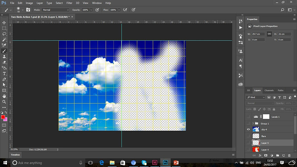
This task was briefly revisited in a unit that I am doing now called References and Sources. I was tasked with having to create four mock up movie posters on a bogus movie title which I have named Two Birds. I created these mock up posters using Adobe Photoshop, using four images downloaded from Google. Here are the images I downloaded from Google to make this happen.


I used the four images above here, I think that I made good consistent use of these images and I fitted each of them into the brief really well. They work well into the posters created by me and I will describe them in greater detail all the more as the evaluation goes along.
The sky image I used quite a lot as a texture in some of the posters, for instance, in the screenshot below here:
What has begun as a sky...

has been transformed into fire and this looks really good I think and very realistic and looks like real fire. This looks really good and like a real action flick.
The birds however, the tutor in my lesson was interested in what was to become of the birds and this is the result:

I transformed it into a chrome steel like logo and added relevant typography to this to give it an action packed title. I think that it looks interestingly amazing and the aeroplane gif image was part of the logo indicating that the criminal couple might flee the country after causing devastation. I also think that this too looks amazing, but needs more work to make it look realistic as well as incorporating it into the logo, maybe putting it between the couple to indicate a heartbreaking feel to the film.

I used two shades of grey to paint the two birds as part of the process of creating a steel logo design for the mock film.

I then added a bevel and emboss effect to the logo on the circle surrounding the birds, it is looking more and more realistic all the time now and I think that it is coming along great now.

The bevel and emboss effect has now been added to the birds. It is looking more and more coherent all the time. Maybe not the result I have hoped though, but I think it looks realistic enough.

But the steel like typography makes up for it though and looks realistic enough for an action packed adventure.
5 Movies that have inspired the genre for this title and work are the following:


The above 5 movie posters are all linked to the same title above as they incorporate pretty much the same as what is in my movie poster for the action genre. They are action packed movies that contain romantic elements as well.
The western version however was created using a YouTube video tutorial and downloading of fonts to do this. This is the tutorial I used to create this poster as an aid:
I find the Blue Lightning TV tutorials very useful and fun to do which I will talk about more in my other blogs. I followed the instructions given to me to the letter and also involved me having to download the Photoshop file for this exercise:

The link is in the YouTube video description in which the tutorial was in. How the images were fitted into the poster range from the following techniques.

I separated the Two birds and embedded them onto the wooden wall by using the multiply blending mode. This could be work of art outside a saloon to give the Wild West of America a whole new incentive. However, given the couple are a violent sociopathic psychotic brutal murderers and bank robbers wanted by the marshals and sheriffs

The beautiful wooden wall is now completely covered in blood as they look to have shot dead the entire saloon patrons before making their great escape into Mexico. This really does look the part of a violent bloody western and very convincing too.

The entire of the wanted poster is now completely blood splattered. I deliberately left out the couple in this case for now so that you can see what is to come of one of the images used for this task.

I used the sky image as part of the texture for the poster to give the bloody poster some scope. I think that this works out really well. It is hard to be seen here as it is all redded out in the poster.

I have now given it a more bloody outlook on a black background as if there is blood dripping off a sign or whatever. It gives the violent western a great sense of what the movie is about and the poster kind of speaks for itself.

The movie is complete with typography and I've fazed out a lot of the bloody background above this screenshot. The red between the words Two and Birds is a blood squirting from beneath and probably soaking the wall and elsewhere. I think that this looks good now, except that picture of the couple looks neat and should not look this way after blood was gushing almost everywhere around it. I should fix this up.

Which I did and now it looks more convincing as there are traces of blood all over the image. It looks realistic now.
Western movie posters that have inspired this design for me by looking at them are:


These are westerns that link to the same type of style that is contained on my Two Birds western poster. All film titles are violent and bloody to watch, but in these cases, very little romance though as my western poster contains a wanted poster with a man and a woman on it. I used the inspiration from these posters and transformed it into my own design and incorporating romance into my designs and I think that it works really well. So far, I've found this unit interesting and of there are two more that I have to talk about here and so far it is happy days.
I've taken my design for the mock up movie poster to a new level by creating a horror version of the actual bogus film title in question. This however was easy enough to do, but I managed it nonetheless. This process began just like this:

The sky image of my choosing, I thought I'd make a texture out of it, but looking at this, it is just an image of a sky for now.

I now made it look into a sinister looking texture by making it red and black. I painted this layer red and then blended it using multiply and this so far is the result, but it is early at this stage as to how it is going to look, but looks promising.

I experimented a whole lot further with the levels and the black and white adjustment layers. They have completely taken away the sky image now and this looks very much like blood splattered all over a black background, just like the western movie. To look at this now, the two posters look similar to each other, I might revisit this in the future before the end of semester.

The characters and the two birds have now been added to the poster looking incredibly sinister in contrast. I like this feeling into the movie, it has got a feel of Fatal Attraction and The Hand That Rocks the Cradle to it and I think that is good. It might be more like a suspenseful chiller as opposed to a horror movie.

The poster is now complete. The aeroplane image I transformed into a hook with blood dripping out and the typeface indicates that this is indeed a horror movie as there is blood dripping from the letters. The typography I experiment with a little more to make it fit nicely for a suspenseful thriller in due course, but at the moment it shall remain a horror movie.
Horror movies and vaguely similar that inspired my horror design for this poster are from the following:


Although most of these aren't horror in a sense, they are similar as they are slasher movies or have violent bloody and gutty scenes in them. These inspired my idea for my horror movie like poster.
The final idea for the movie is romance. I liked that idea more as it is colorful and vibrant as well as warm and loving. The brief is really fitting here. Let me elaborate further with a few screenshots:

First I used the sky image on top of a beautiful pink background, I think that this would work really well here to begin with.

I transformed the birds using the rubber tool set to 0, softening it in the process into a heart indicating that there are lovebirds in the actual movie.

There is a married couple now in the poster, indicating that there is marriage in the movie, a When Harry Met Sally feel if you like. I think that this gives a beautiful look to the poster and a loving one at that. It is also beautiful and vibrant in color.

The poster is complete in no time at all. This was an easy going process doing this poster. It looks really coherent and fun loving as well as warm as depicted with the sky, maybe set in summer time perhaps. Overall I found this unit quite good really.
The movies that inspired this genre are as follows:


These are movies that are all lovey dovey and romantic which fit the same description as the romantic version of my mock up poster for my Two Birds sequence.
IDEAS GENERATION
Most of the techniques used in this unit ranged from both digital and trying a dab hand in experimenting with pencils, paper and pens and so on. The digital part like I said was by far the more easiest as mentioned above, drawing by hand is one of my weak spots when it comes to my work. I've used many different designers for inspirational purposes, but the one I feel the most inspired by is Saul Bass, I used a lot of his methods for my design work. However, looking back, I could have developed my thumbnail sketches a little bit better to show more ideas of the films in question here. This was completely new to me at the time and I was unsure of this process. A bit more research perhaps, but I am starting to understand it a little clearer now. The type used for most of the posters is a little rough and ready. As I was also studying other units at the time, I was working round the clock in trying to get everything done in time for the deadlines, so I may have rushed the work somewhat, but this is a problem that has been resolved as I am now on top of things a bit clearer. If given another chance to do this unit, I would reflect on feedback given to me and do better what I didn't do right the first time and most importantly take time to think things through and take a deep breath and really think about what it is I am doing.
TASK 1-MESSAGES (THIS DOES NOT EVALUATE THE ENTIRE UNIT, THERE WILL BE FURTHER EVALUATIONS IN BLOGS AS THE UNIT PROGRESSES)
I used only Photoshop to design the four mock up posters and I found this easy enough to do and a bit time consuming to do in terms of putting ideas together. I think that they look real enough as final outcomes and been successful so far. I am a bit of a whizz on Photoshop, so I found this easy enough to do. I used inspirations from the designers movie poster designs above to create these posters and pretty much put in my own take on all four of them respectively. There isn't anything that I would change very much about any of them at present, I might revisit this before the deadline for this assignment, to maybe try out different imagery out and maybe use Illustrator to do this. There are many more future projects I am sure in Photoshop for me, I'll consider this a good starting point for the projects coming my way in the future.
Comments